Hello there, I'm Alex, a Seattle-based Product Designer. I help companies innovate and grow with better research, design and testing. More
With over a decade of experience as a designer, I’ve had the opportunity to work on a diverse range of projects from end-to-end with some amazing people, helping both startups and established companies build intuitive and user-friendly digital products.Throughout my career I've specialized in applying design thinking and scientific methods to derive innovative solutions for complex design challenges.Outside of work you can likely find me outdoors, playing sports, hiking, or spending time with family. I also enjoy reading, learning new subjects, and playing the guitar—outlets that fuel my passion for problem-solving both in life and design.If you're looking for a designer who’s driven by change, curiosity, and collaboration, feel free to connect and let's create something amazing together.
Featured Work

TennisPal
Strategy, UI/UX, mobile
+
Overview
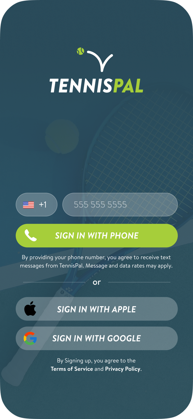
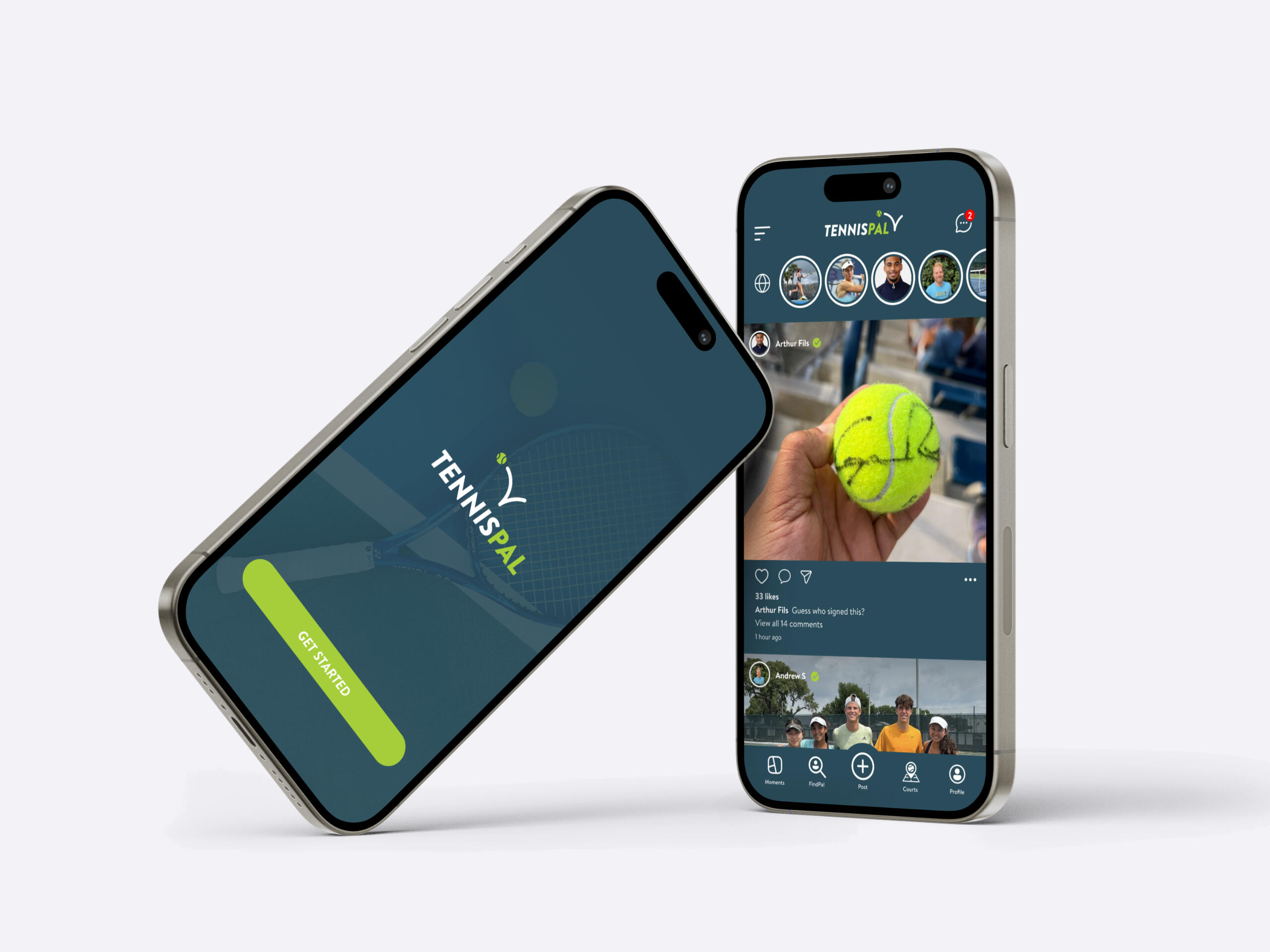
TennisPal, a tennis app designed to connect players with local hitting partners, faced challenges with user retention and growth. The onboarding process was overly complicated, and users struggled to find and schedule matches, leading to frustration and drop-offs. The app also needed to increase paid subscriber adoption and revenue while preparing for future scalability.
Role
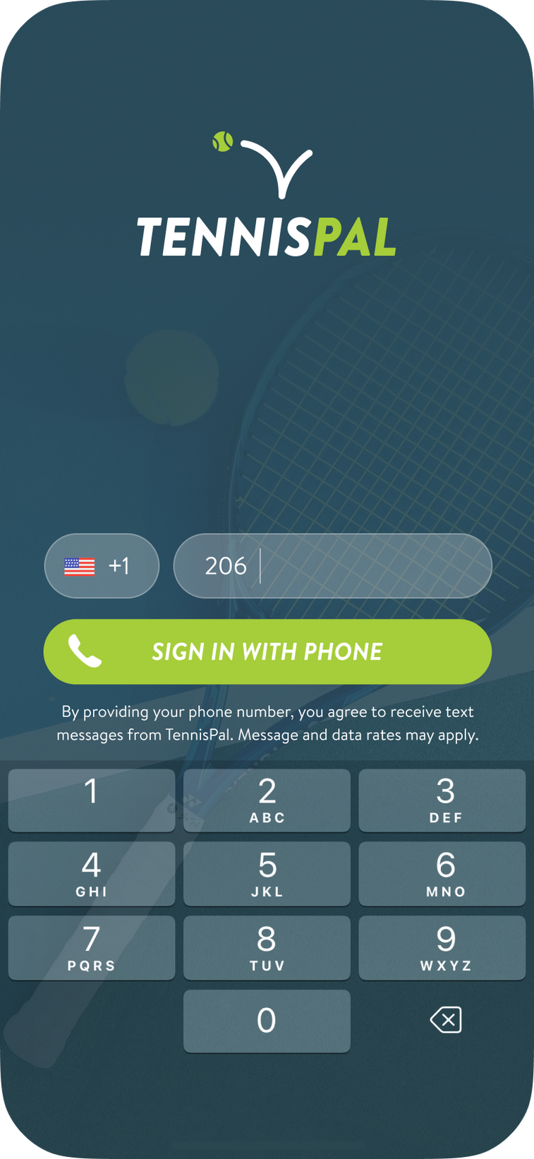
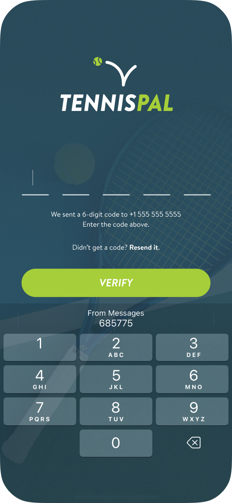
As a UX Consultant for TennisPal, I collaborated with the CEO to strategize and brainstorm ways to increase paid subscriptions and help scale the app. I leveraged my experience as both a designer and an avid tennis player to improve the app from a user perspective and add new features that I know tennis players would use and love. I started by streamlining the onboarding process of the existing app and conceptualizing a Match Scheduling feature to enhance usability and boost retention.
Challenge
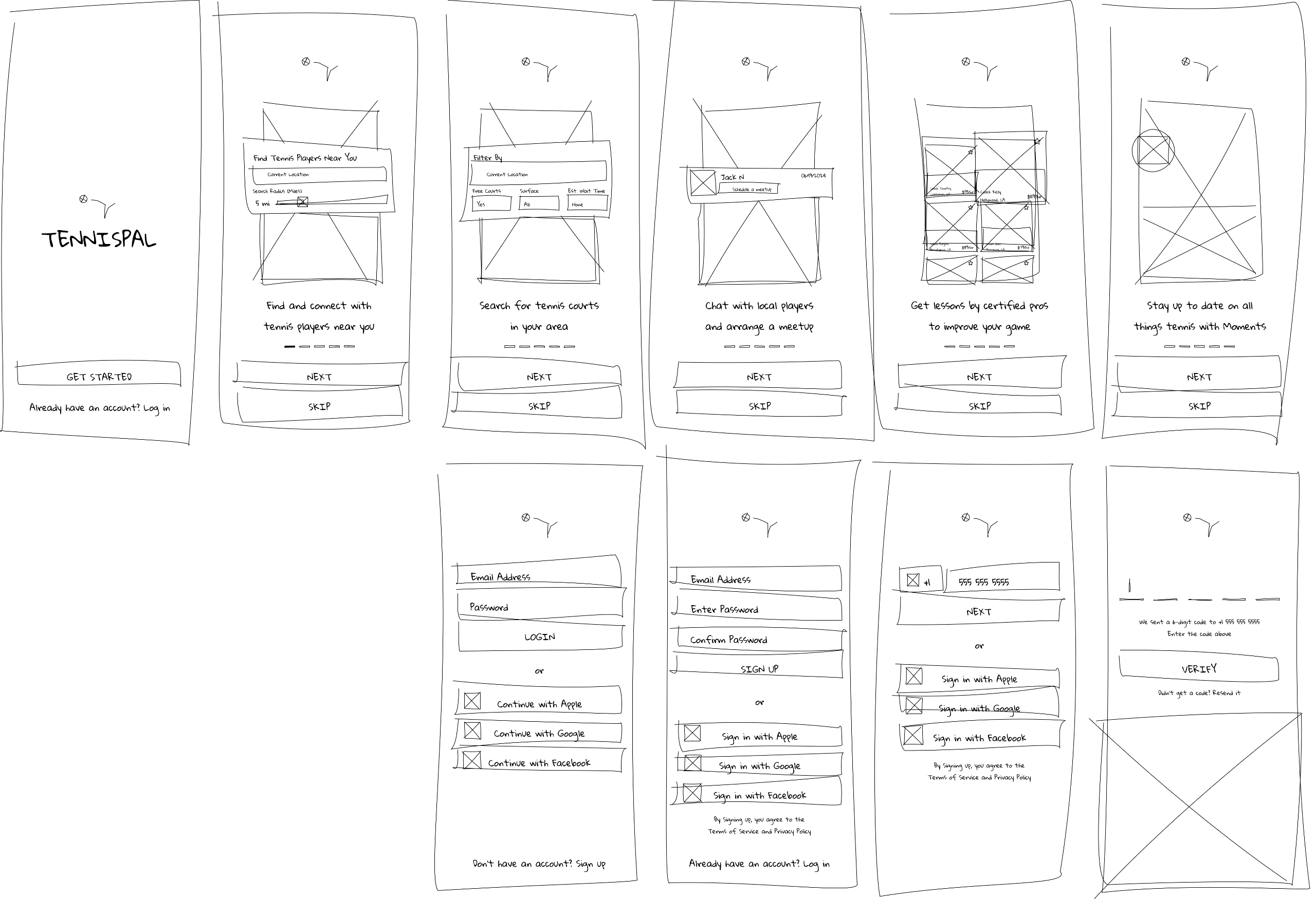
My goal was to simplify the app’s onboarding flow down to no more than 3 screens and create a more intuitive way for users to find and schedule matches within the app. These improvements aimed to increase user satisfaction, encourage repeat engagement, and ultimately drive paid subscriptions and revenue growth.
Approach
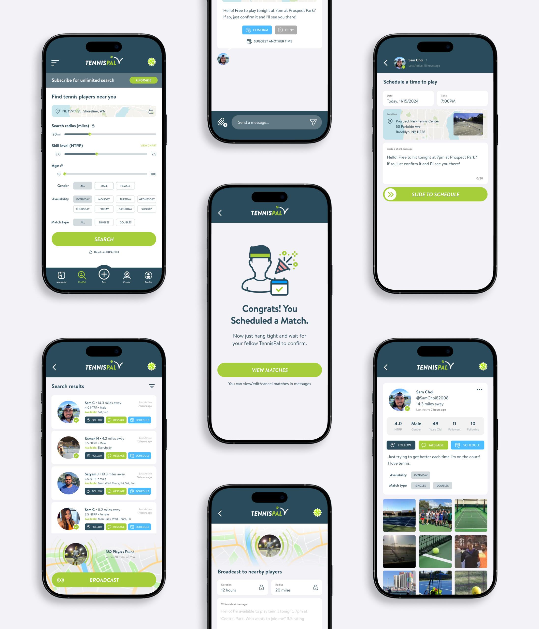
I conducted user interviews to identify pain points and analyzed app usage data to uncover trends and opportunities. Drawing from my personal experience as a tennis player and user of TennisPal, I conceptualized and designed the Match Scheduling feature. This new tool allowed users to seamlessly align schedules with potential partners, addressing a key pain point in the user journey.
Result
The redesign resulted in a 20% increase in onboarding completion rates and a 30% improvement in match scheduling efficiency. Users reported higher satisfaction with the app’s ease of use, and engagement metrics showed steady growth post-launch. The Match Scheduling feature became a core part of the app’s experience, helping to retain users and laying the foundation for increased paid subscriptions and long-term scalability.

Saveplates
0-1 design, UI/UX, mobile
+
Overview
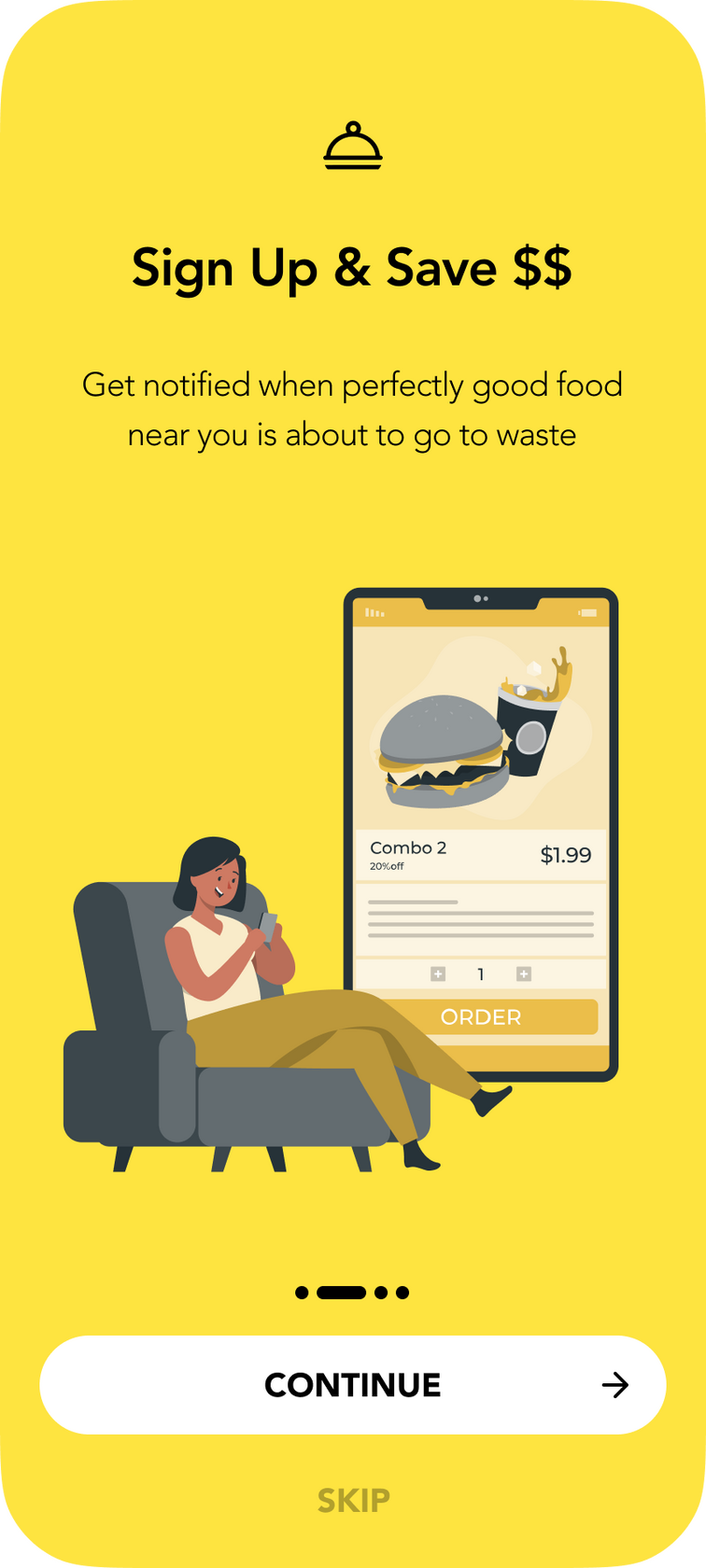
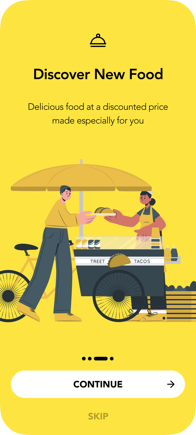
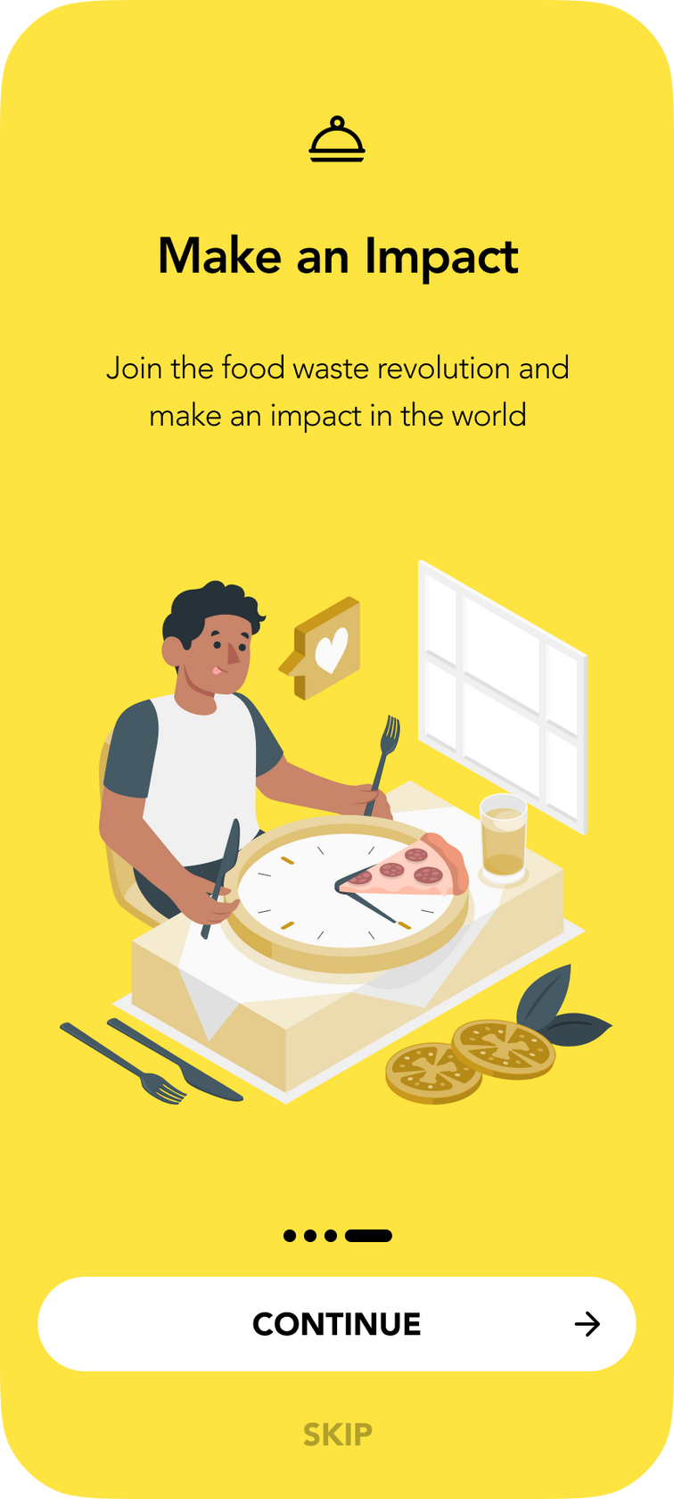
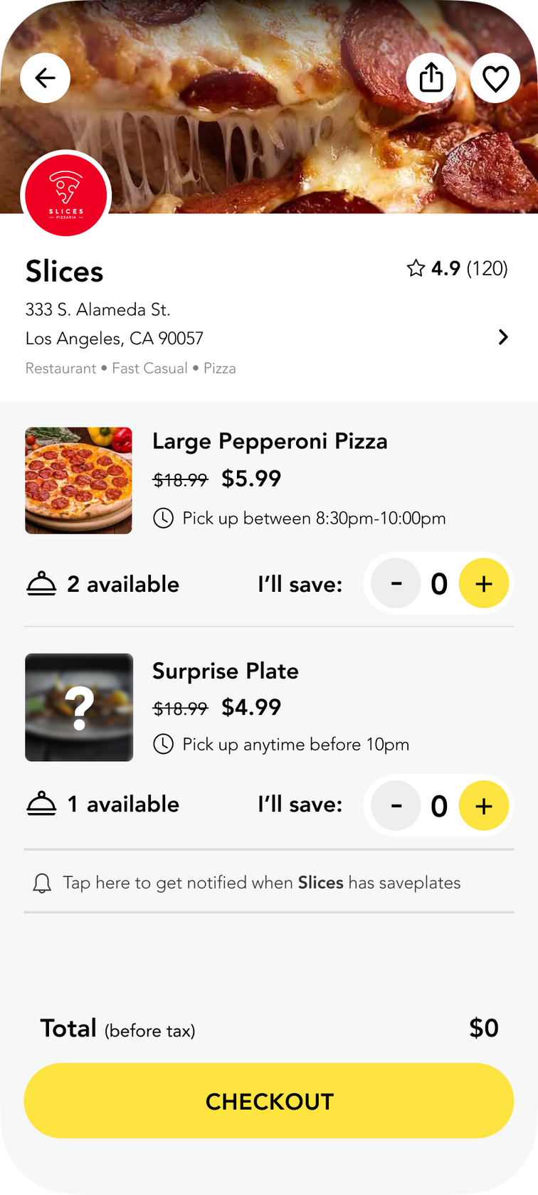
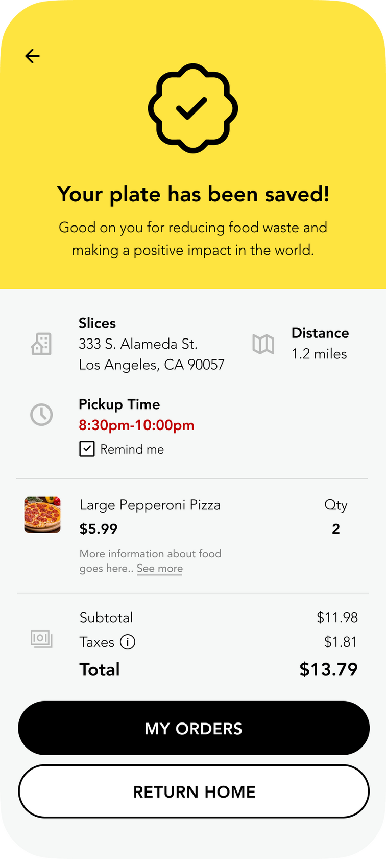
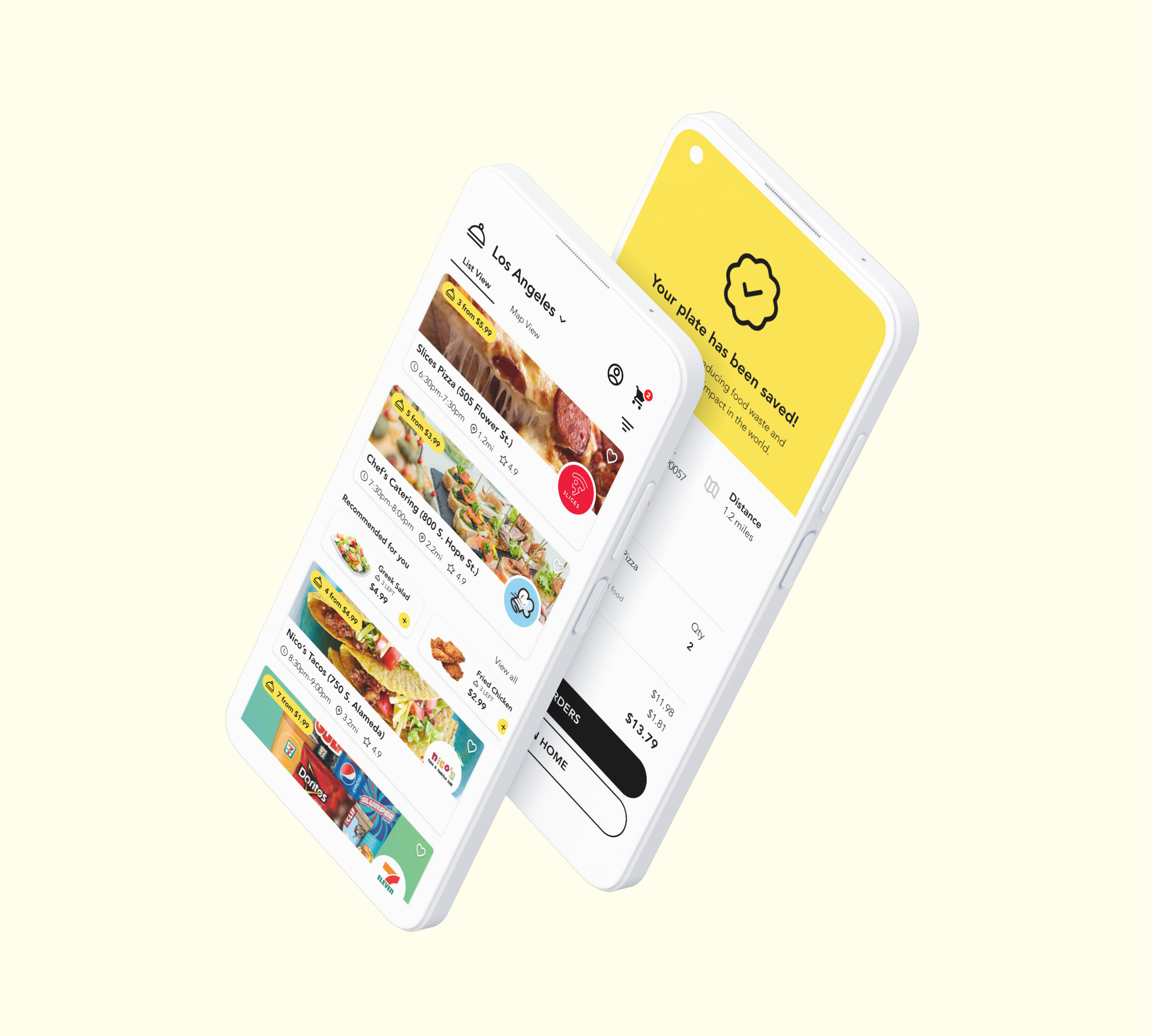
Saveplates was a social enterprise project aimed at reducing food waste by connecting consumers with local restaurants offering surplus or near-expired food at discounted prices. With a twofold mission to reduce food waste and provide affordable meals, Saveplates aimed to create an impact on the environment and in the community.
Role
As the founding designer, I took the app from 0>1 while collaborating with a few other entrepreneurs over the course of a year. The mission was to give unsold food a second chance and work toward ending world hunger, providing a win-win scenario for restaurants and budget-conscious diners alike.
Challenge
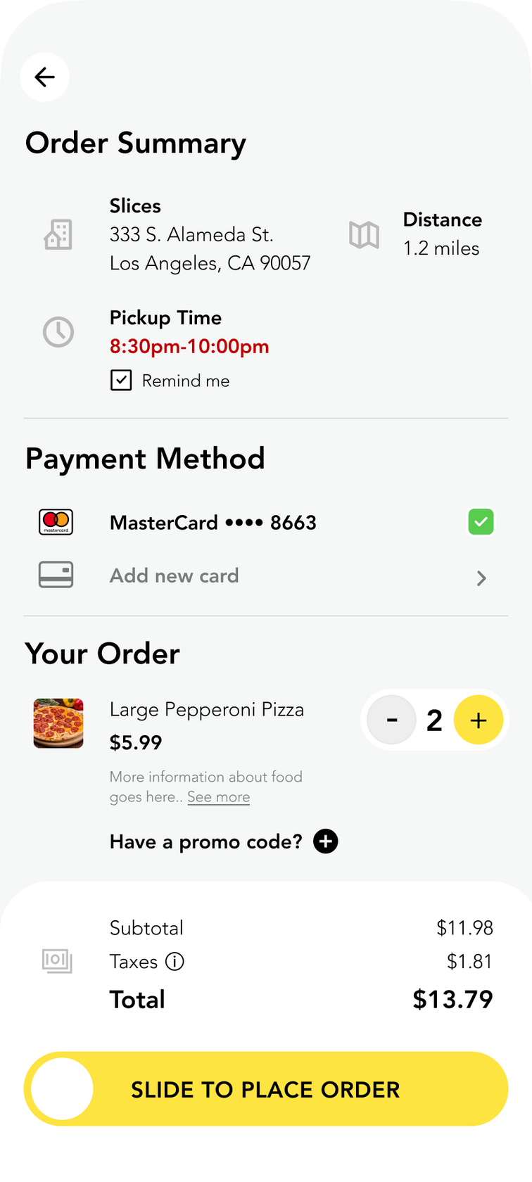
Saveplates aimed to address the challenge of efficiently connecting restaurants with surplus food to consumers in a way that was both timely and convenient. Restaurants needed a simple way to list surplus meals before they expired, while consumers wanted an easy way to find affordable, quality meals quickly.My goal was to design an intuitive app experience that would bridge the gap between restaurants and consumers, ensuring meals could be listed, discovered, and purchased quickly to minimize waste and maximize convenience.
Approach
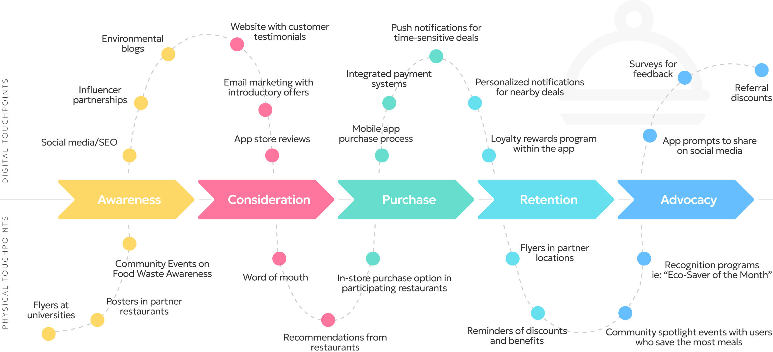
I conducted in-depth user research, including interviews, surveys, and observations at restaurants and dining halls, to identify pain points and key needs. Using these insights, I created user personas and stories to better empathize with users before designing wireframes and prototypes for a platform that prioritized speed, simplicity, and transparency.


Result
Although we couldn’t secure funding to bring Saveplates to market, the project demonstrated strong user interest in reducing food waste through affordable meals. The research and design process showed how thoughtful UX can solve time-sensitive problems while balancing the needs of multiple user groups. This experience gave me valuable insights into creating efficient and impactful solutions for complex social challenges.

Pogoseat
Design system, UI/UX, mobile
Design system, UI/UX
+
Overview
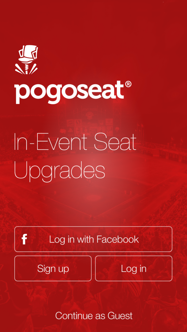
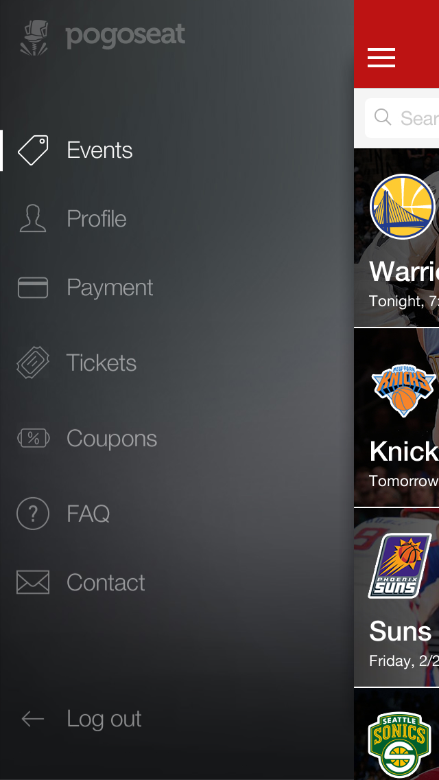
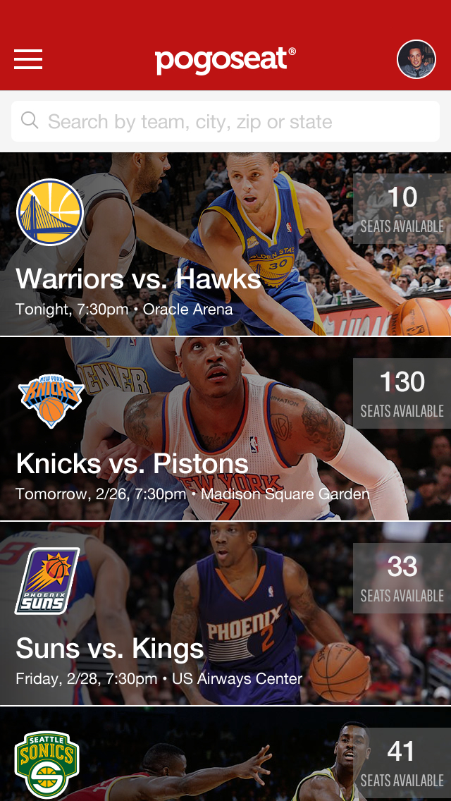
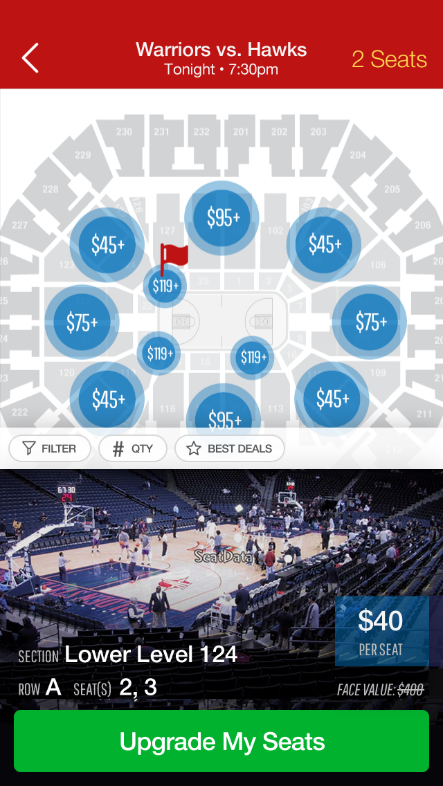
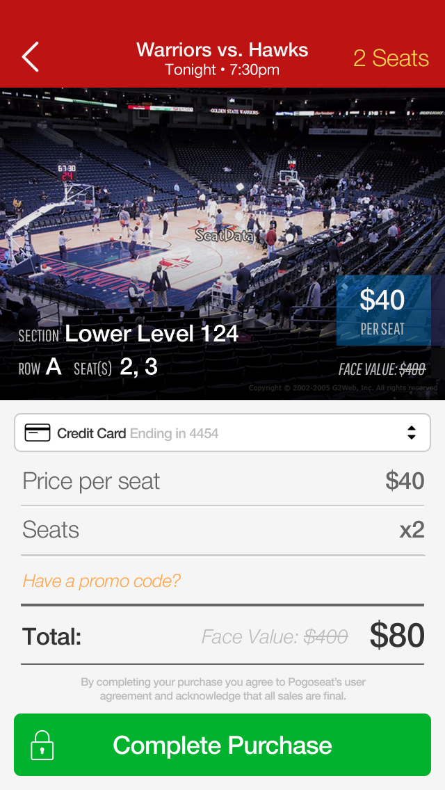
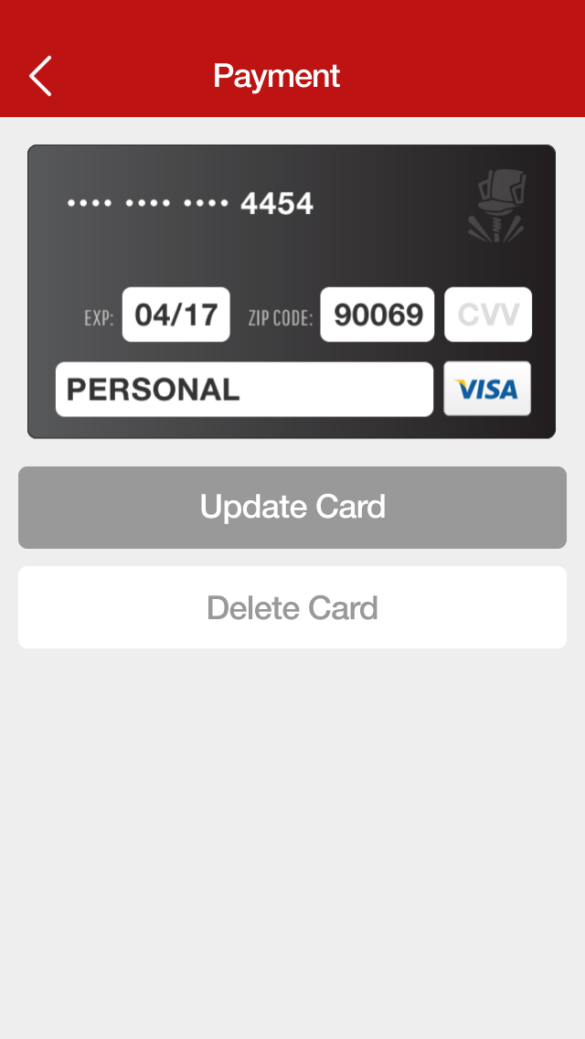
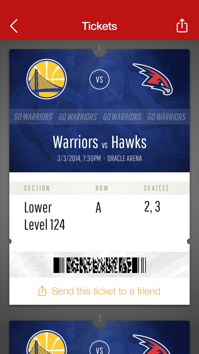
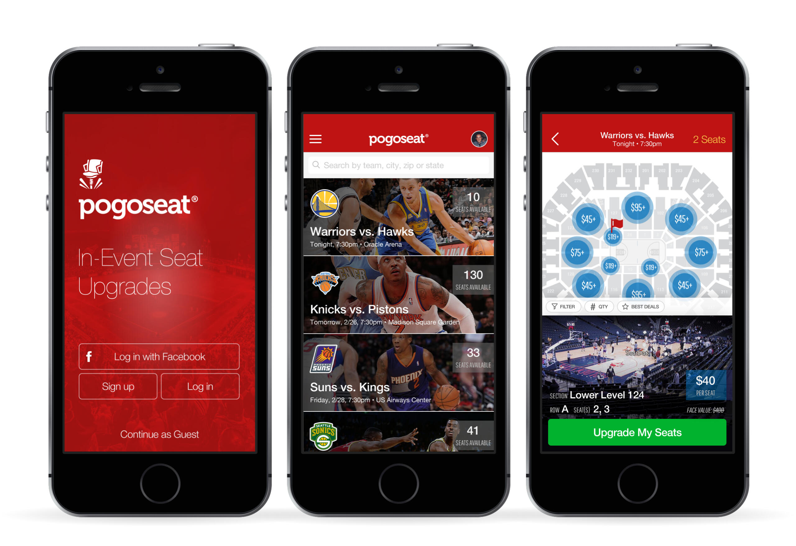
Pogoseat is a mobile ticketing platform designed to enhance the live event experience by allowing users to seamlessly upgrade their seats at the beginning of or during events. Founded with the vision of transforming how fans engage with live entertainment, Pogoseat aims to provide real-time ticketing solutions that cater to sports, concerts, and other live performances.
Role
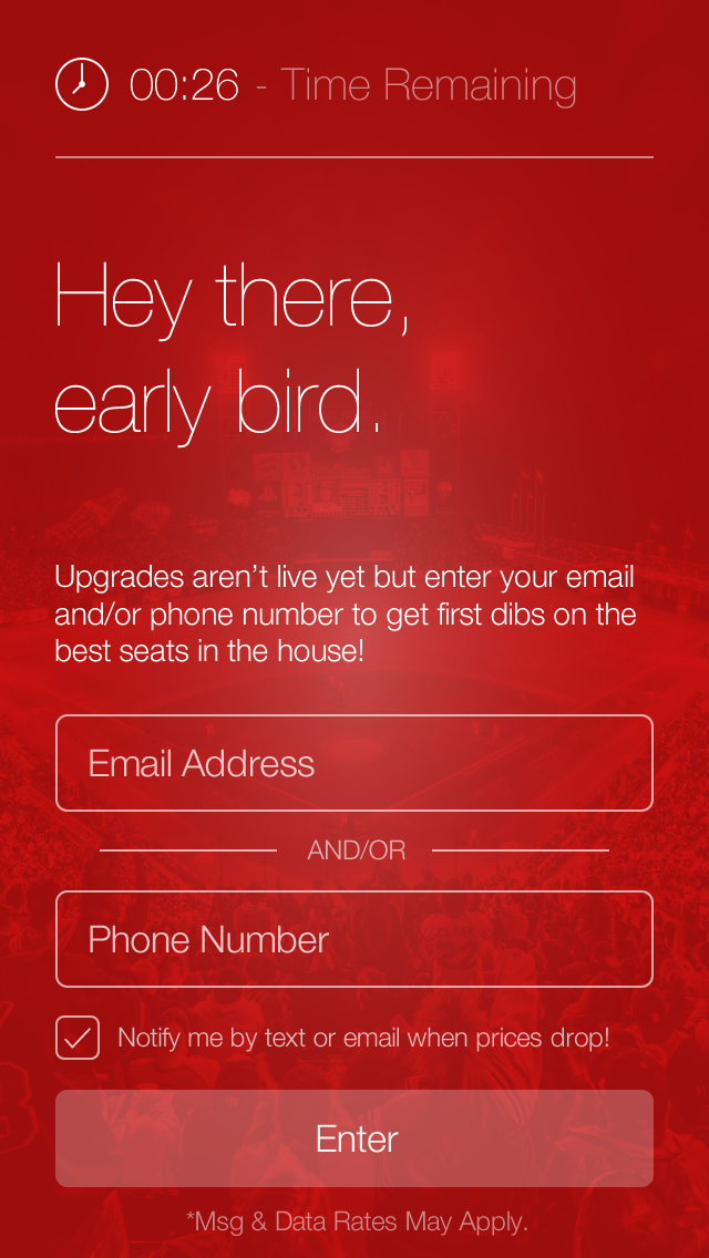
As Senior Product Designer, my primary goal was to improve the user experience by streamlining the ticket-purchasing and seat-upgrade processes. I hoped to increase user engagement and ultimately boost revenue for the early stage startup by making the app more intuitive and personalized.
Challenge
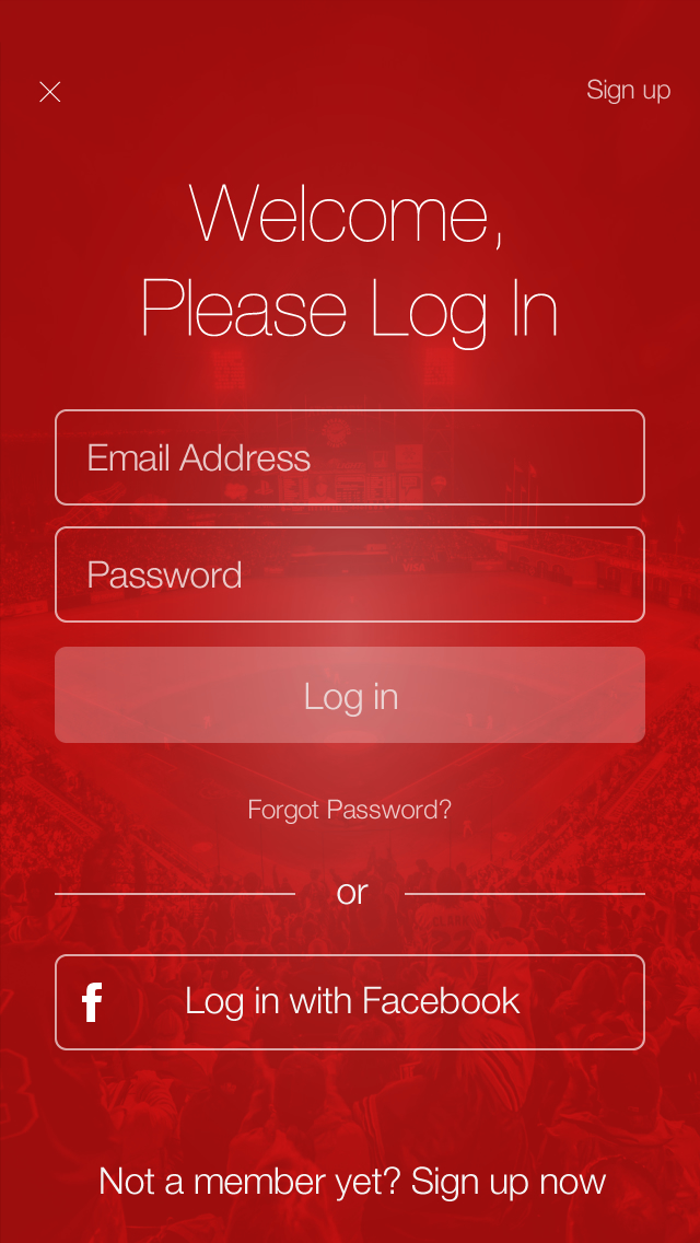
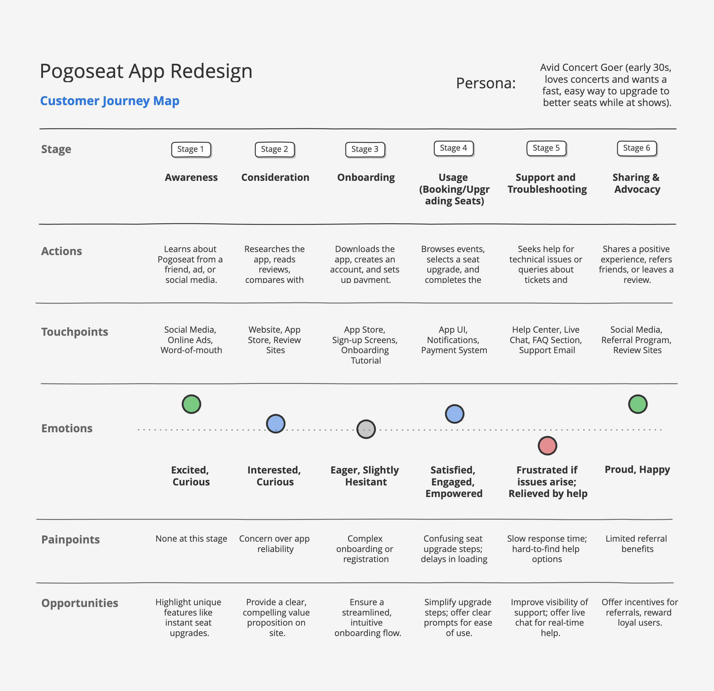
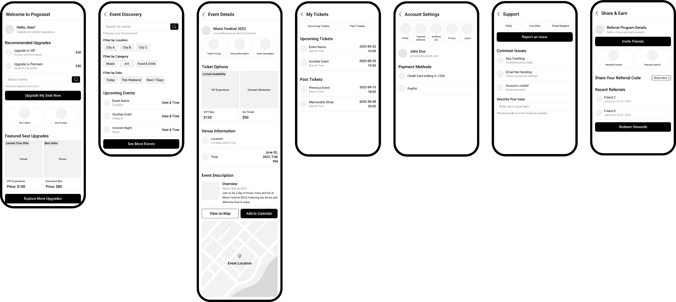
Pogoseat, a mobile ticketing platform, struggled with poor user retention due to a confusing navigation system and a cumbersome seat upgrade process. The app needed a redesign to provide a more intuitive experience for live event attendees.
Approach
I conducted user interviews, surveys, and competitor analysis to identify pain points. Using these insights, I redesigned the app with a focus on intuitive navigation and accessibility. I also created a smoother seat upgrade flow that required fewer steps, making the process faster and more user-friendly.
Result
The redesign led to a 40% increase in user engagement and a 20% boost in revenue within the first three months post-launch. Users reported a significantly improved experience, validating the value of a streamlined design tailored to their needs.
Reflection
The Pogoseat redesign had a immediate impact in boosting user engagement and revenue. A memorable moment came when a user shared how an effortless seat upgrade transformed their night at a concert, reminding me why I love what I do.This project highlighted the importance of deeply understanding user needs and addressing specific issues with targeted solutions. Empathy and early user feedback were crucial in aligning the design with expectations, while the process emphasized adaptability and continuous improvement to create meaningful, impactful solutions.

StackSocial
Branding, design system, UI/UX, mobile, web, print
Branding, UI/UX, mobile
+
Overview
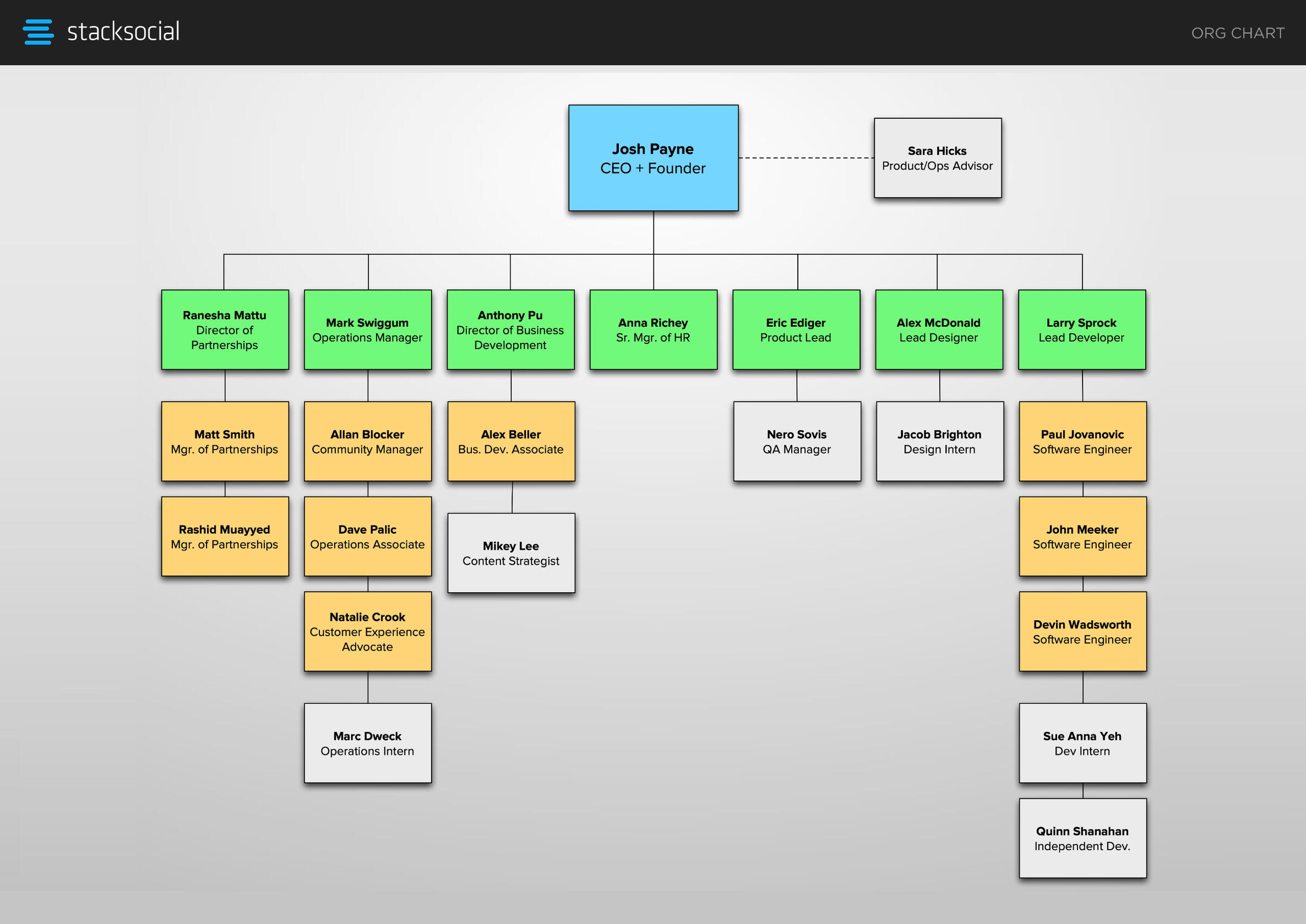
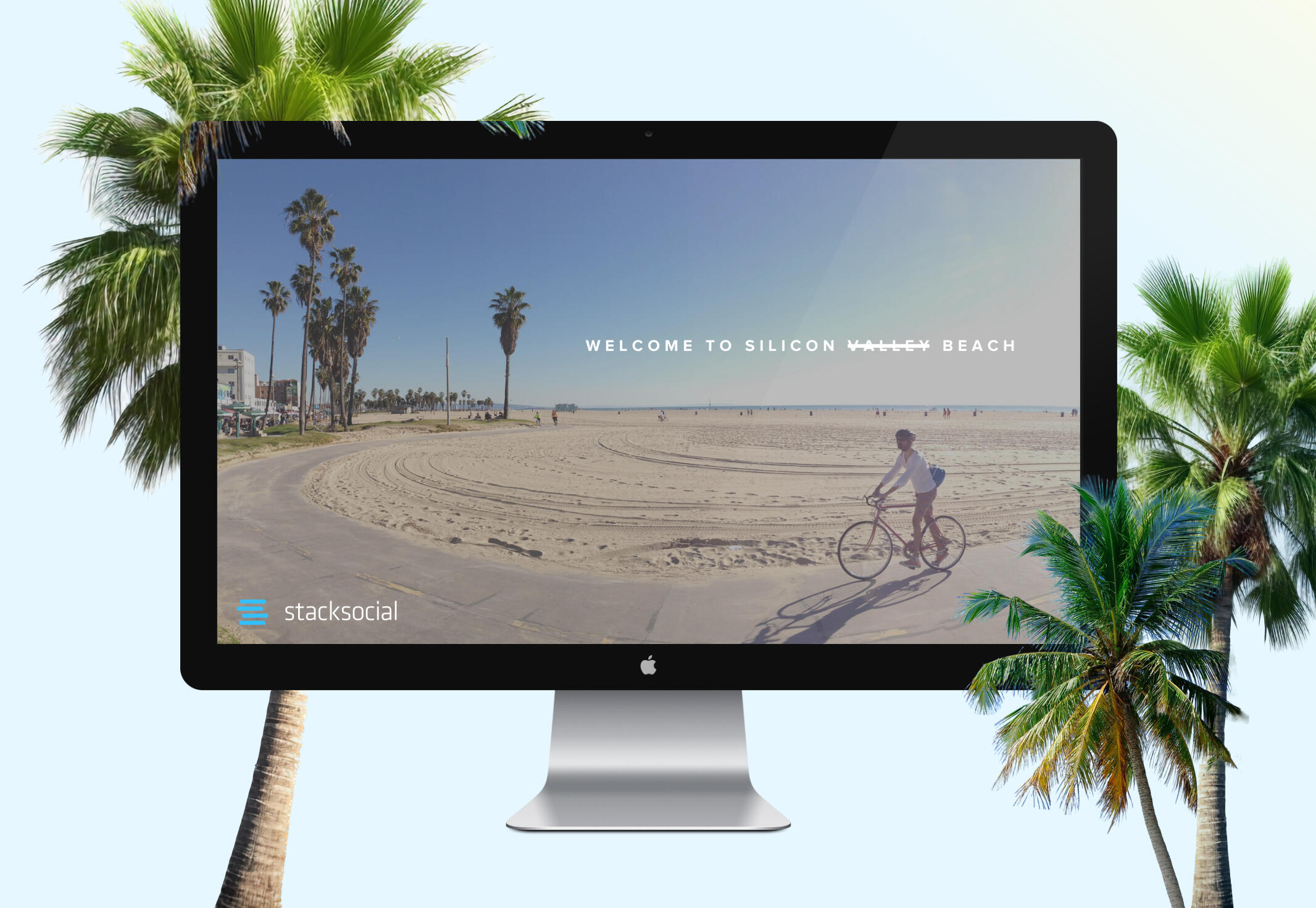
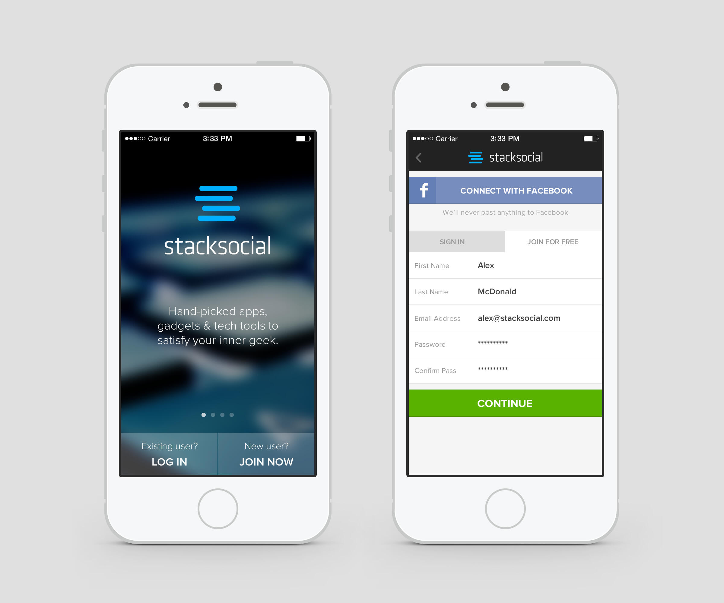
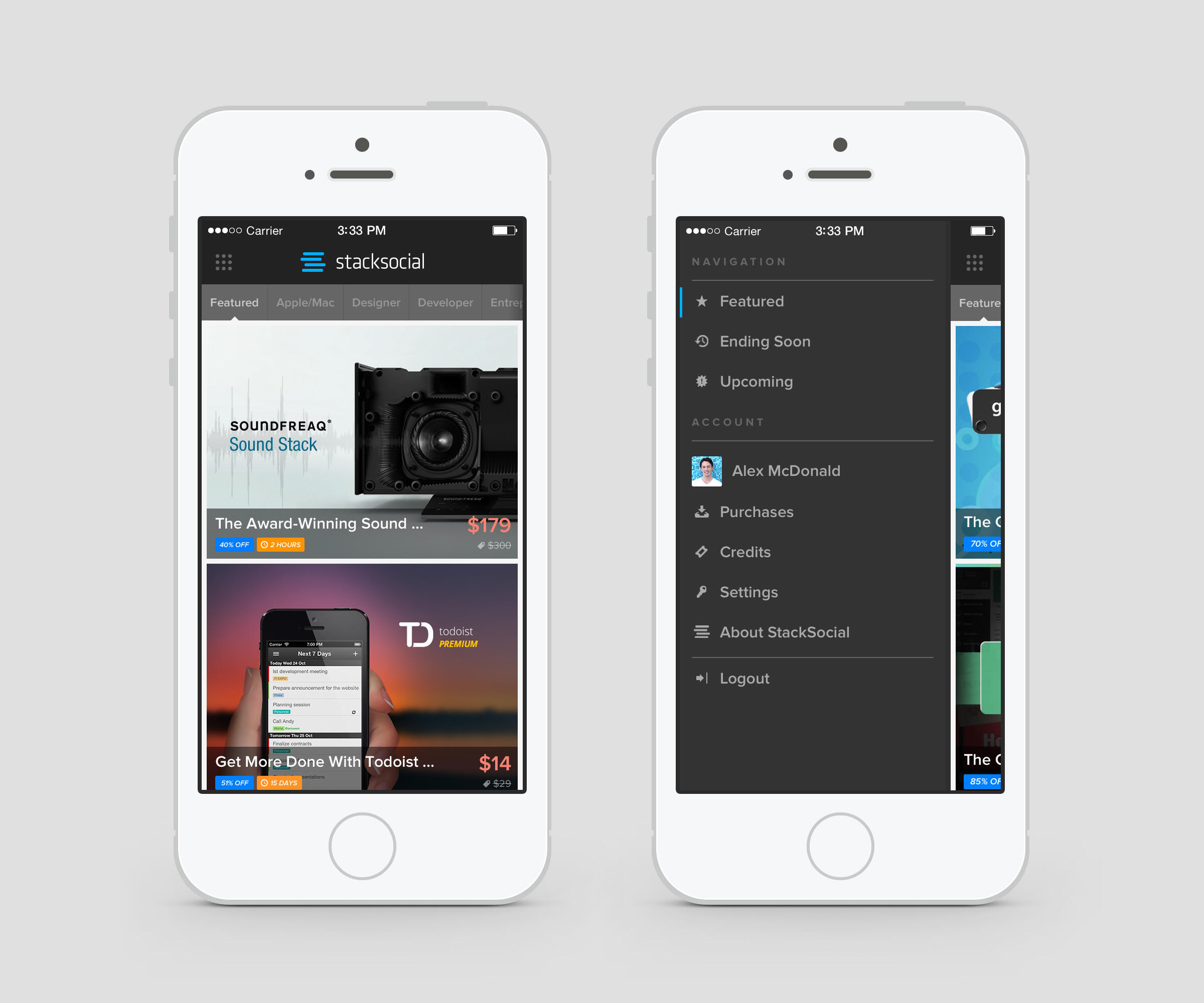
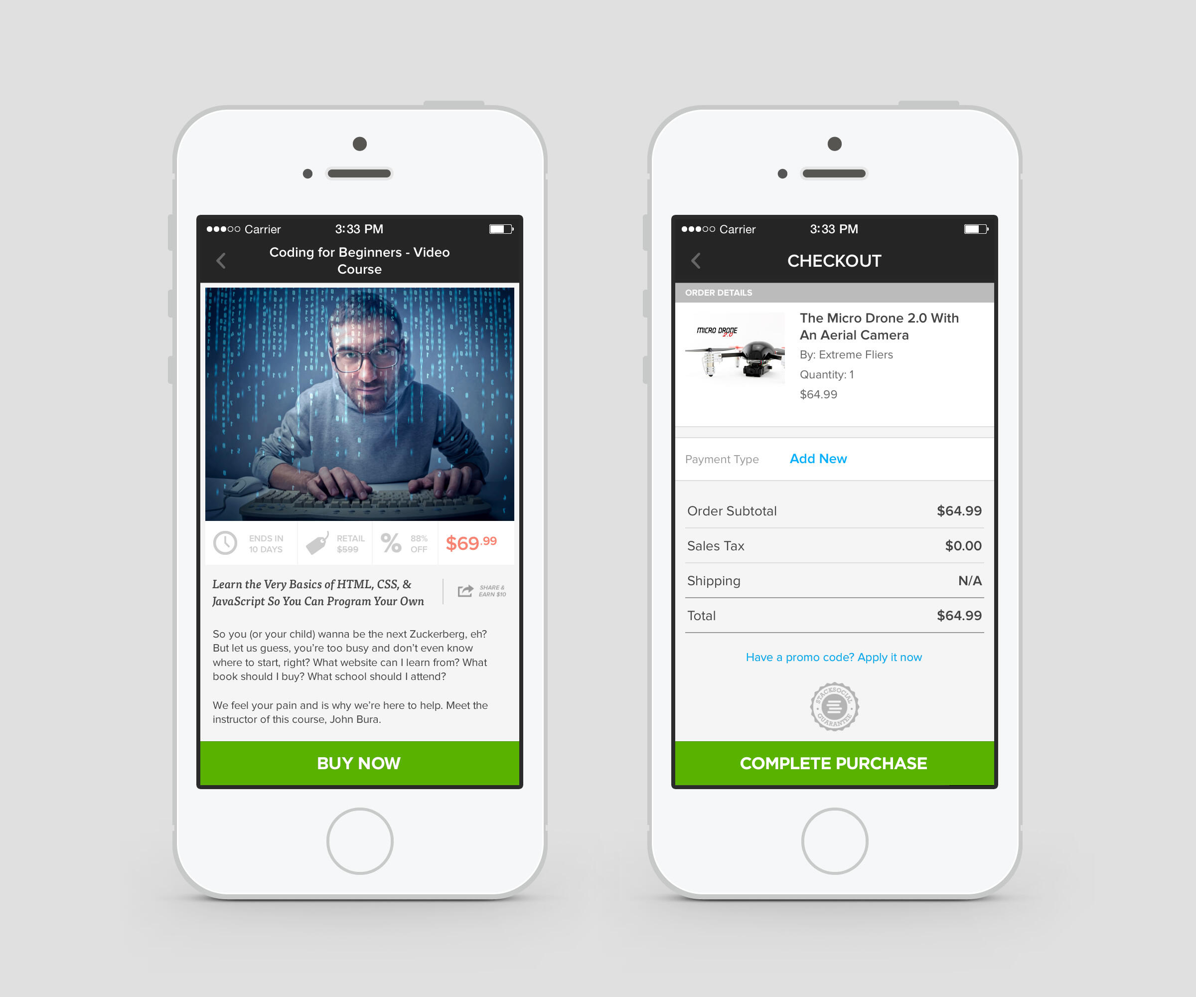
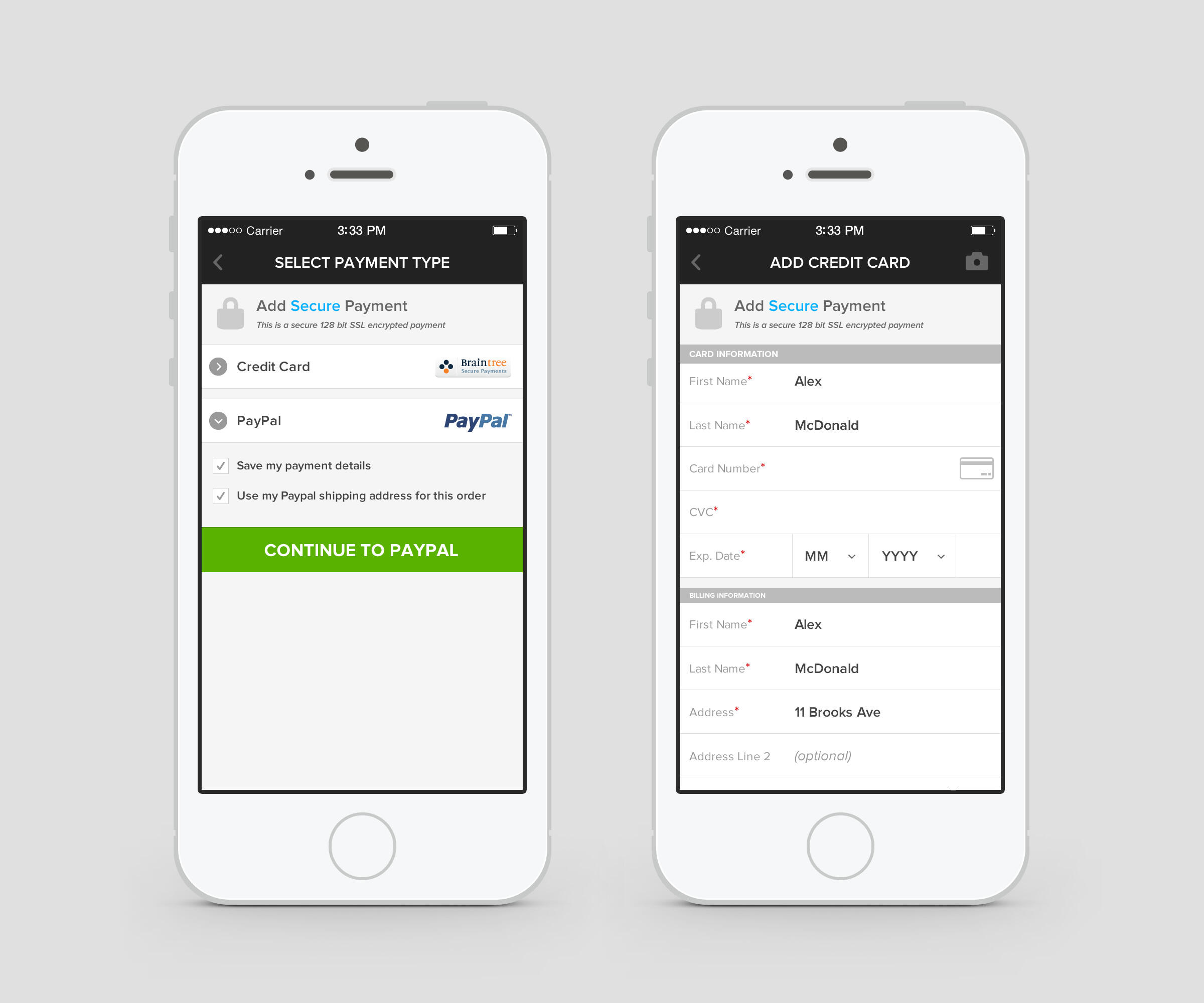
I joined StackSocial as employee #8 and the company’s first full-time in-house designer, starting as Visual/UI Designer before becoming Lead Designer. During my tenure I oversaw a comprehensive rebrand, designed the company’s first mobile app, and assembled a team of junior designers to support the e-commerce company’s rapid growth. I worked closely with the founder, business development team, and developers to shape StackSocial's digital presence across multiple platforms and pave the way for future innovation. In 2014, StackSocial evolved into StackCommerce and was acquired by private-equity firm TPG in 2021.
Role
As one of the first employees at StackSocial, I played a pivotal role in establishing the company’s design strategy and user experience. My focus was on creating a cohesive, innovative, and trustworthy brand identity that could support the growth of a thriving tech marketplace and e-commerce platform.
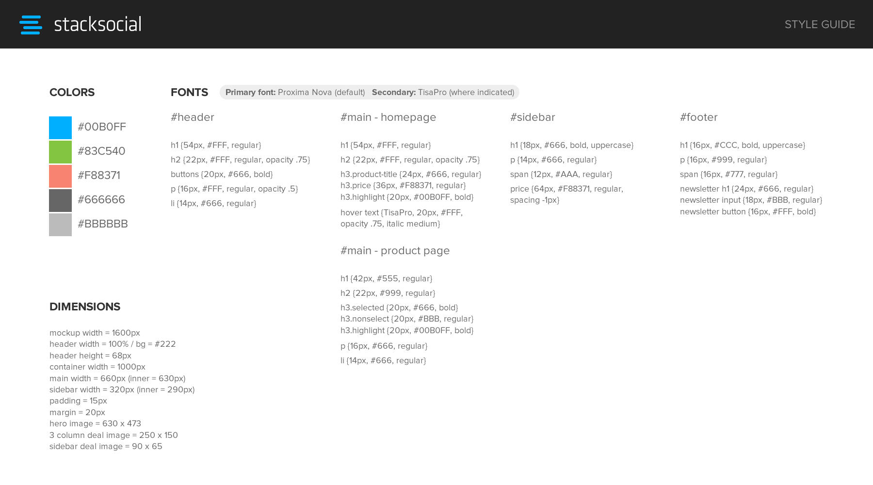
Crafting a Cohesive Identity
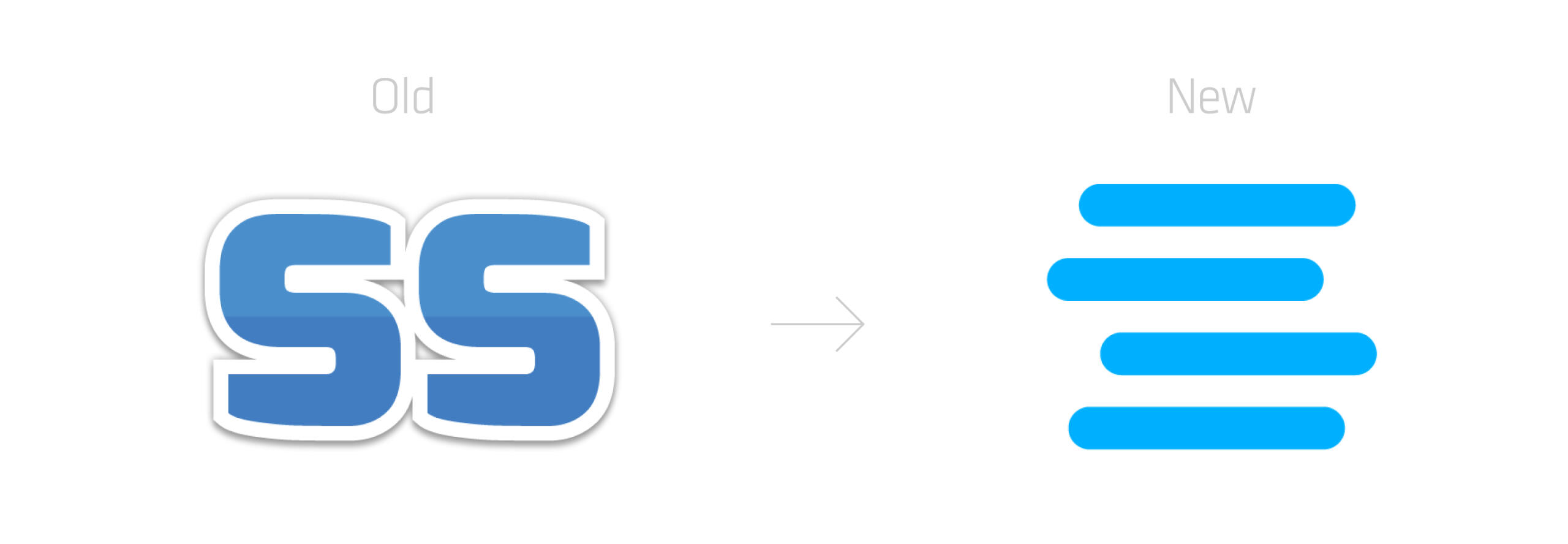
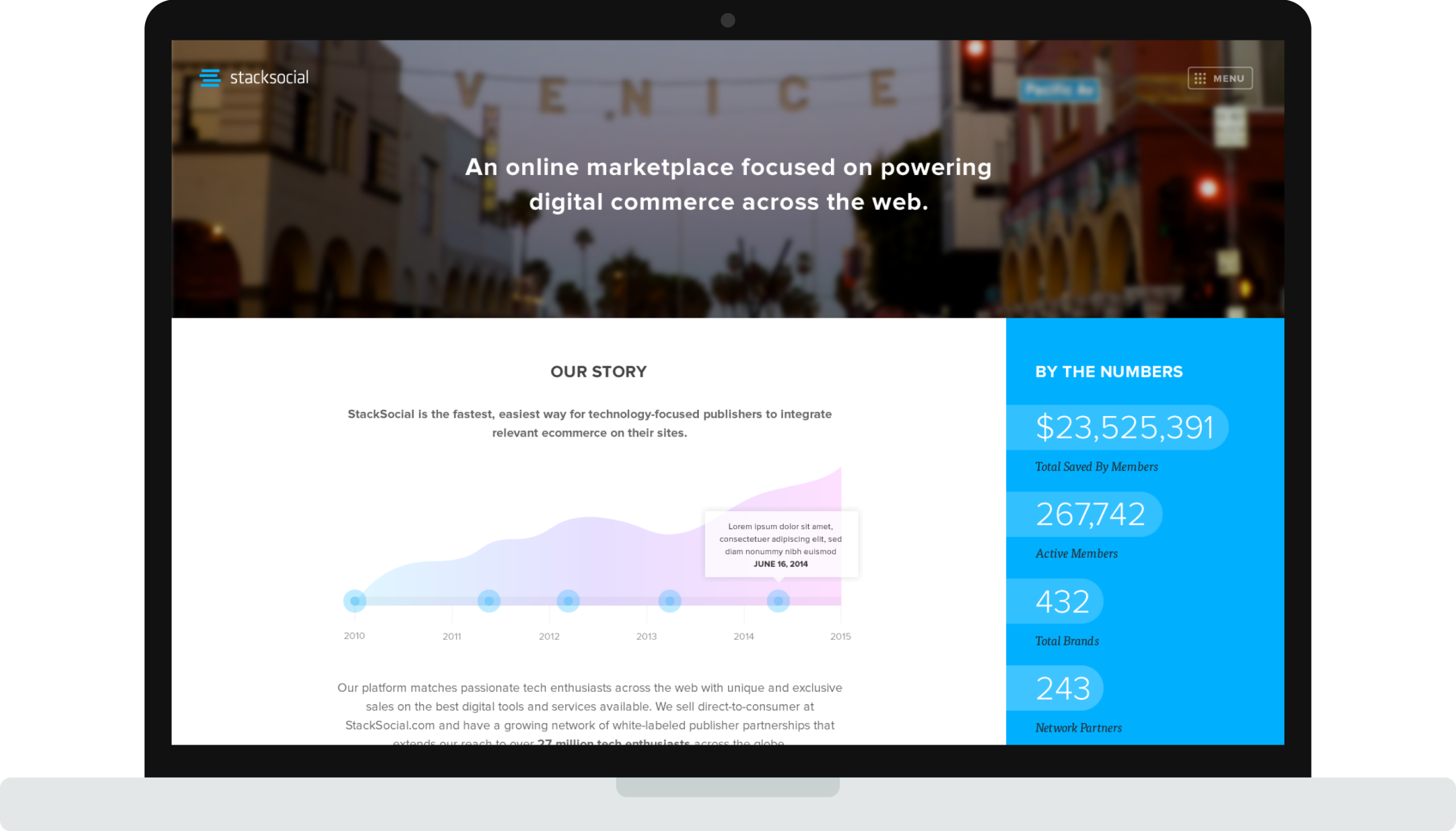
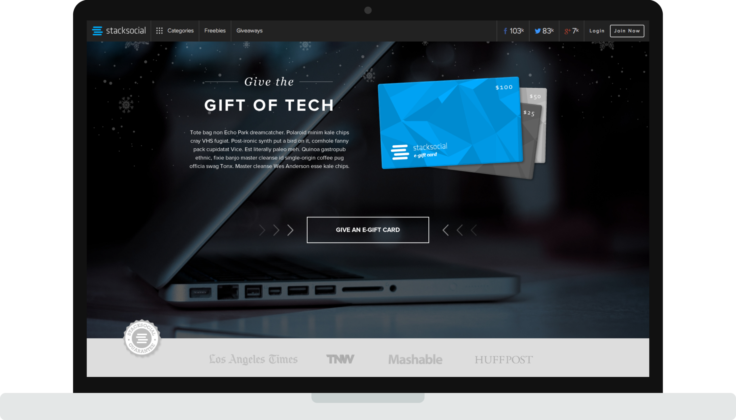
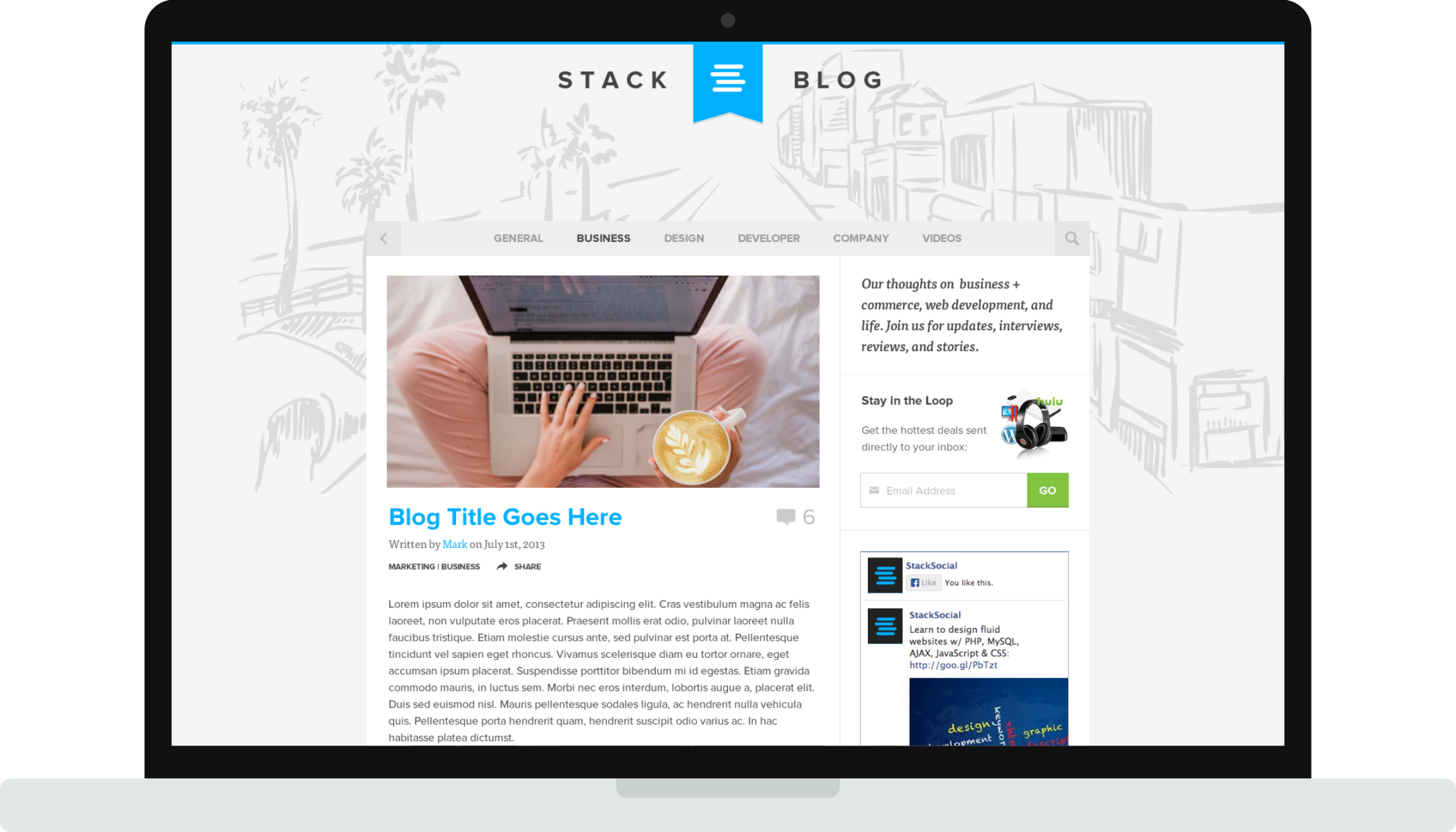
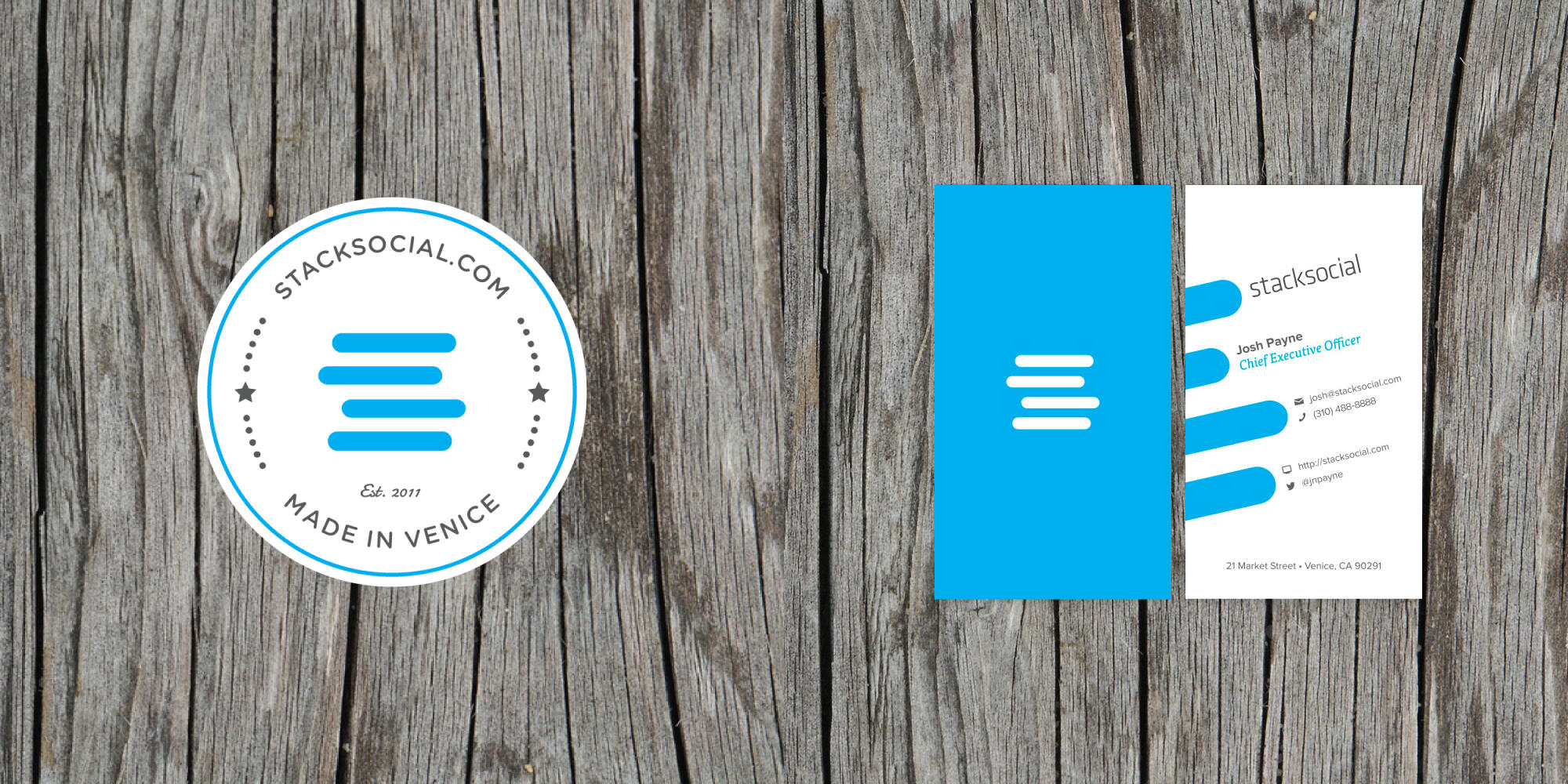
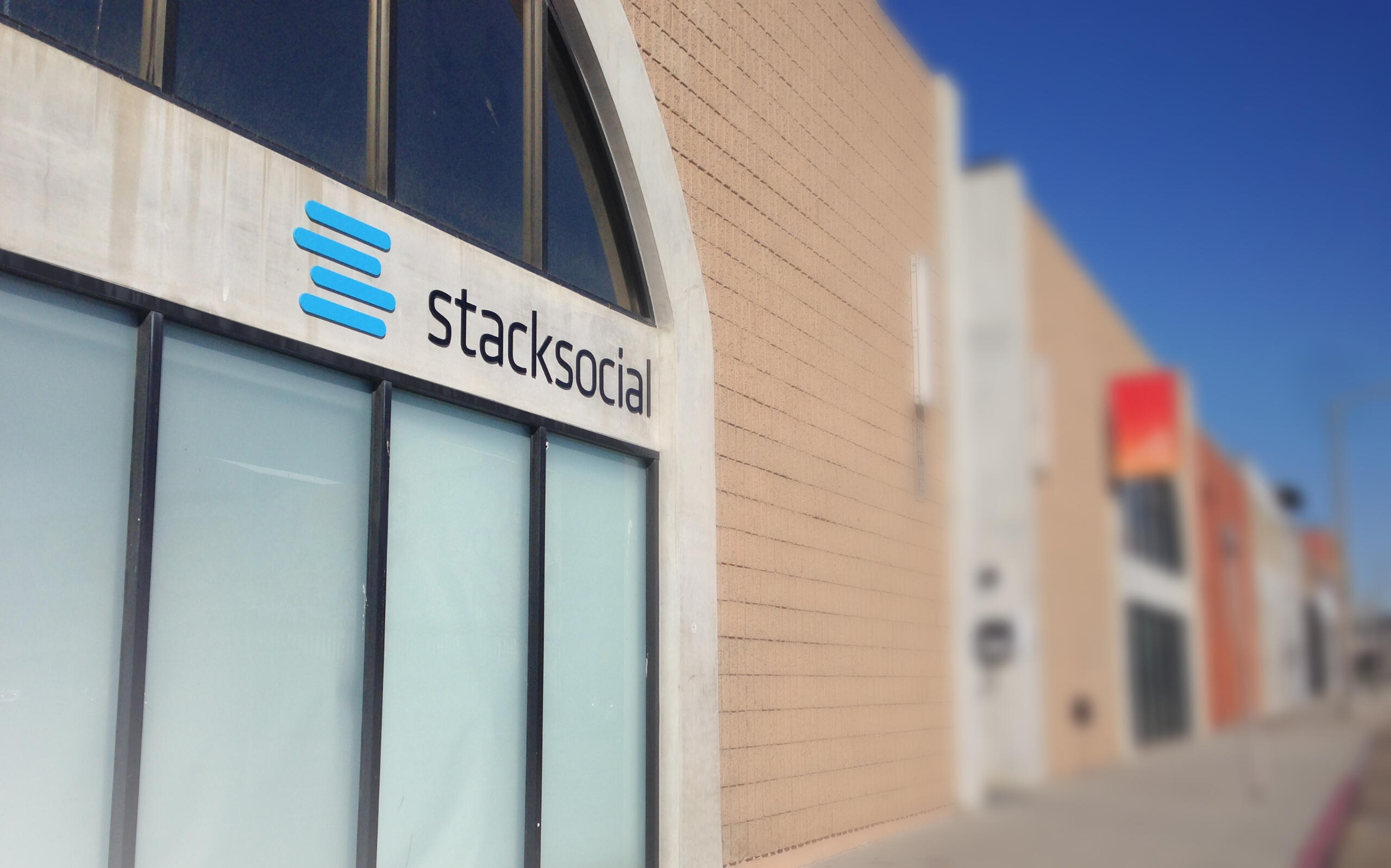
In my first major project, I led a complete rebrand of StackSocial to align with the company’s mission and growth trajectory. From logo design and stationery to web and print assets, my focus was on creating a modern, simple, and tech-forward aesthetic that resonated with both users and partners.
Redesigning a Multi-Channel E-Commerce Platform
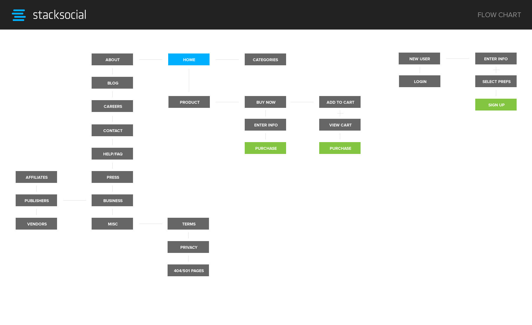
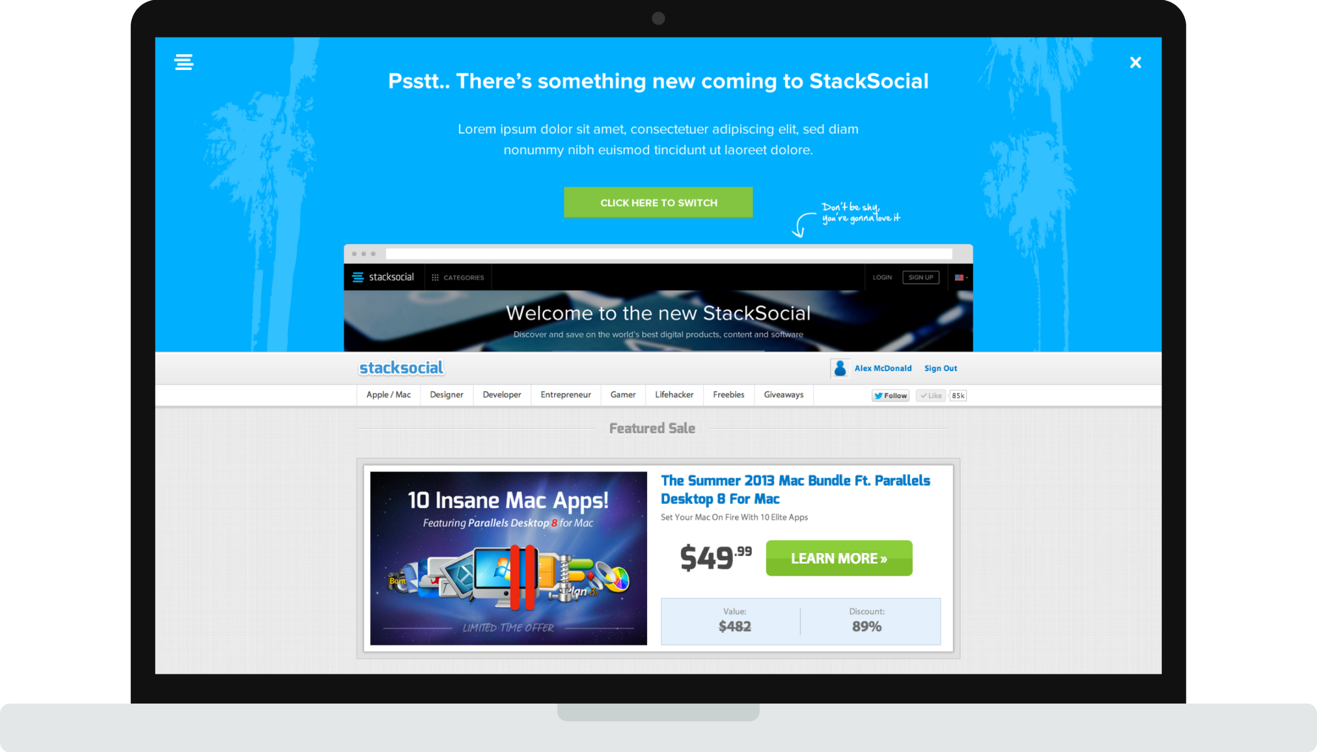
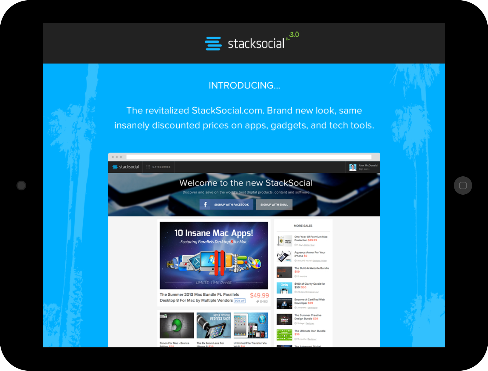
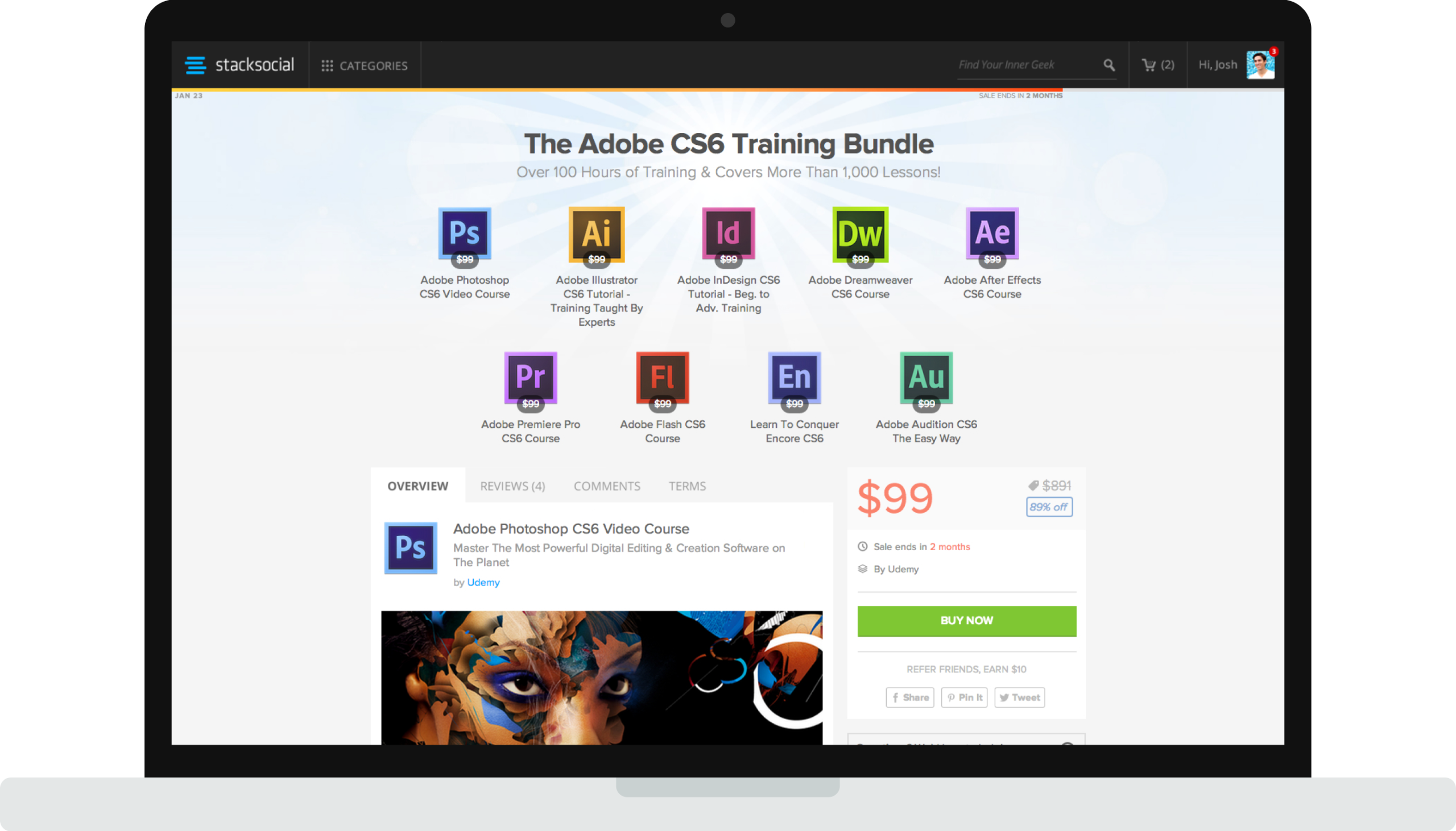
Next, I led a comprehensive website redesign to support the company’s rapid growth. The goal was to create a clean, intuitive interface that made discovering and purchasing curated tech deals effortless for users. By streamlining navigation, enhancing visual hierarchy, and optimizing the checkout flow, the redesign improved usability and positioned StackSocial as a leader in multi-channel e-commerce.The updated design seamlessly integrated with the company’s new branding and provided a scalable foundation for future growth, including mobile and tablet platforms.
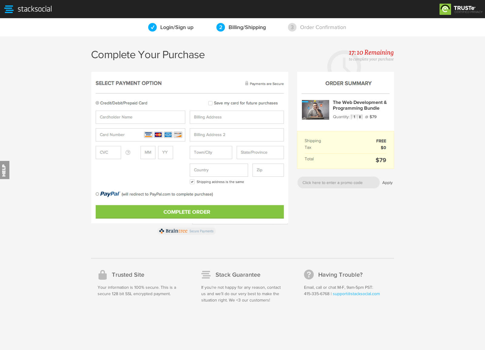
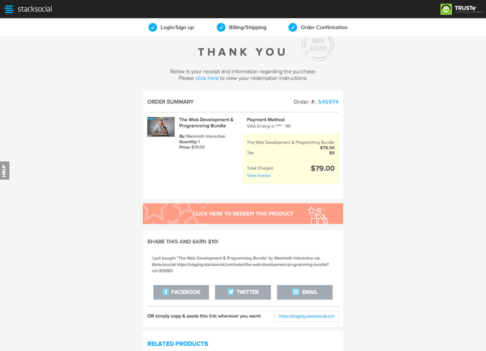
Designing a Seamless Checkout Flow
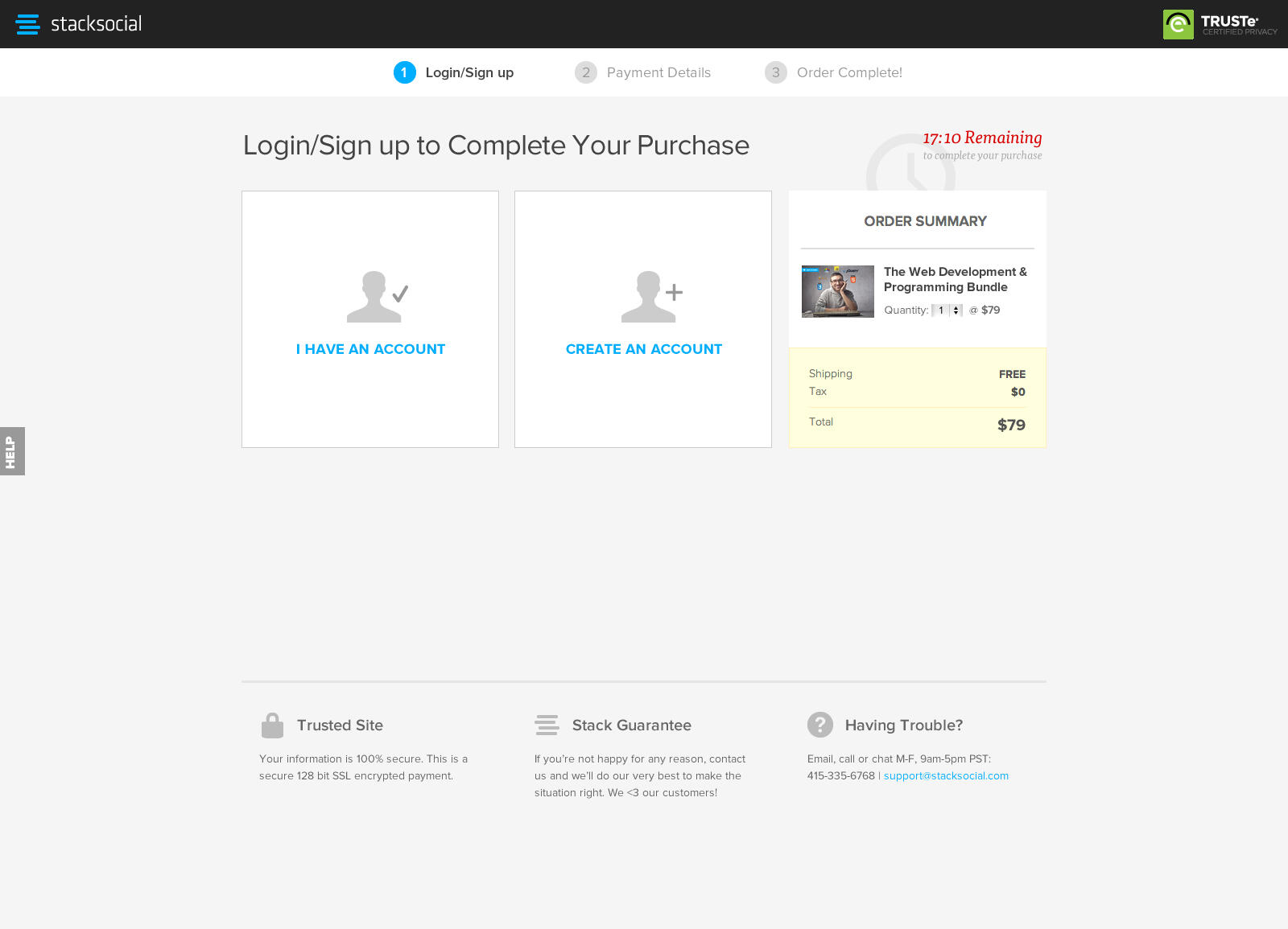
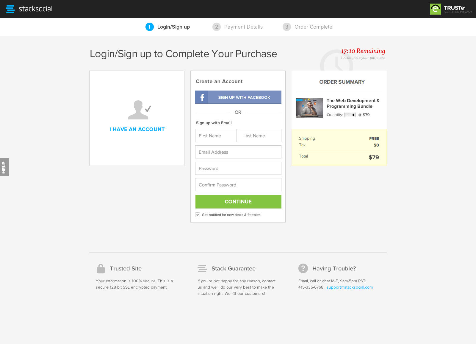
The most critical part of the responsive website redesign was the checkout process, which was reimagined to reduce cart abandonment and ultimately increase sales. I implemented visual design elements such as progress indicators and clear CTAs to improve the UX and effortlessly guide users through the checkout flow.I then conducted thorough A/B testing to identify the most effective layout, colors and messaging, in addition to removing unnecessary form fields. With the new redesign we were able to achieve an impressive 33% increase in conversion rates.
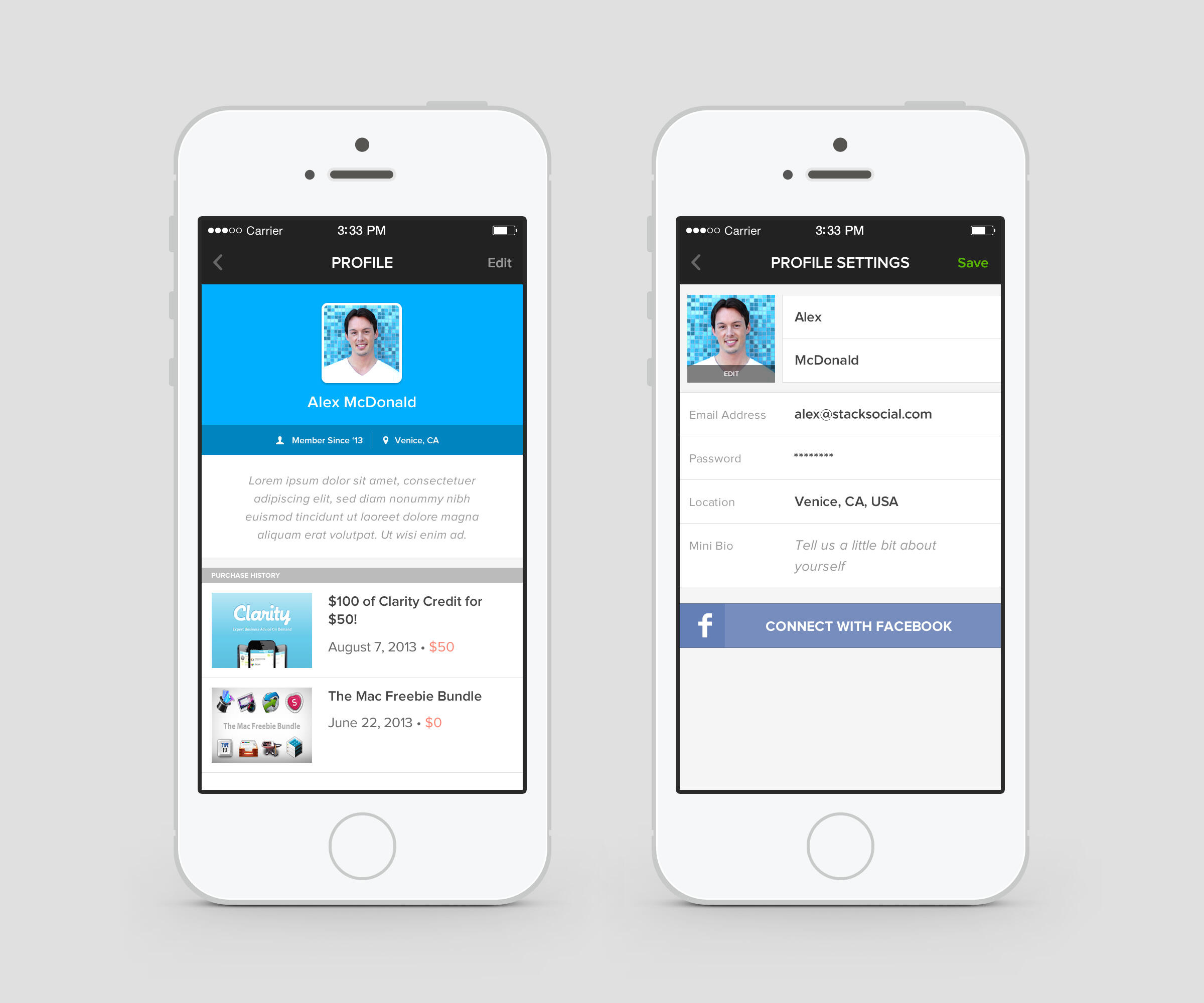
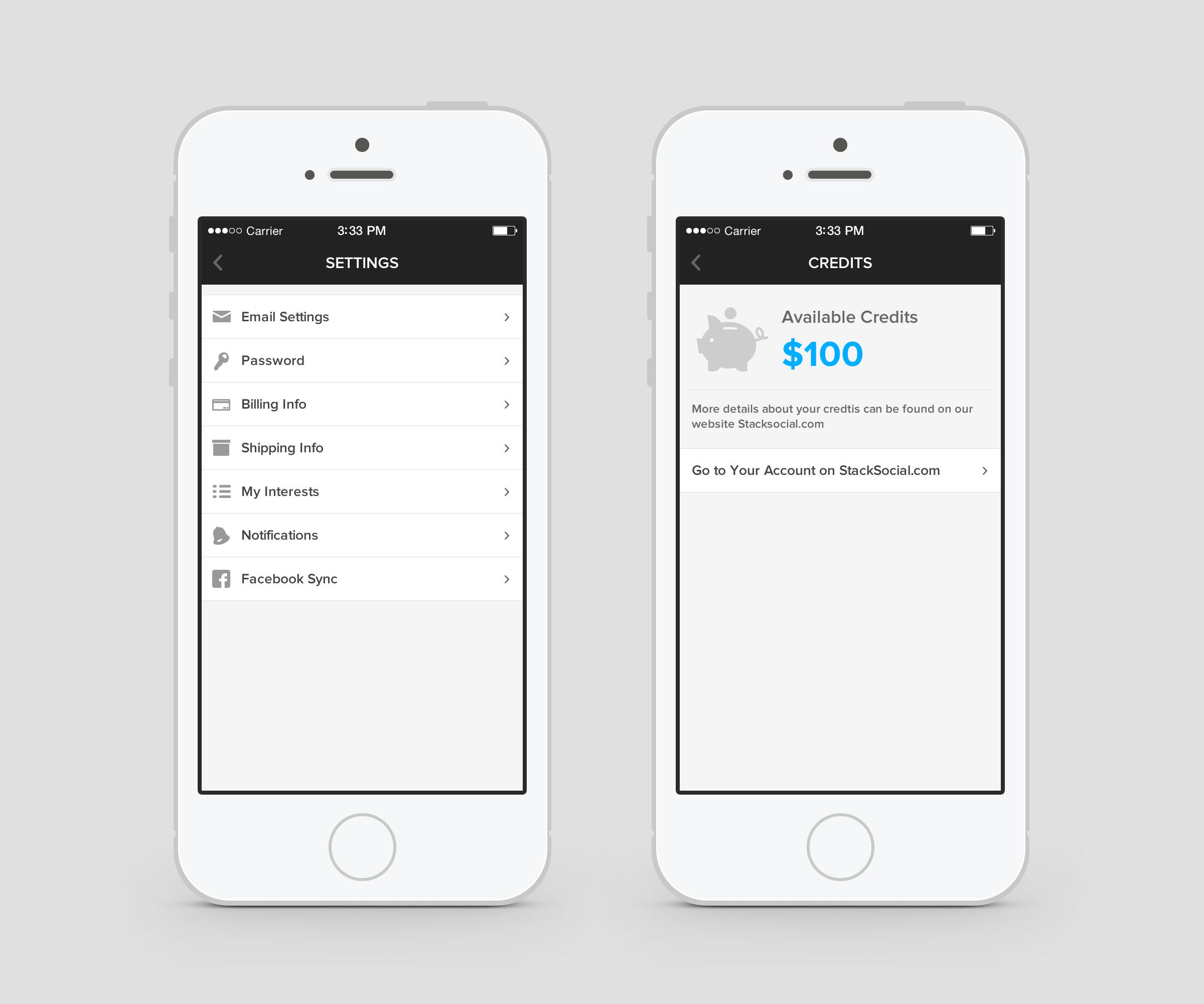
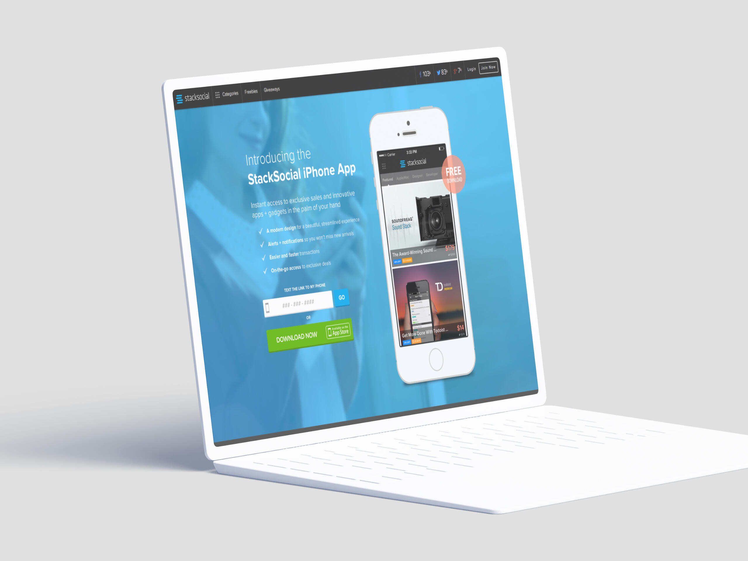
Designing the First Mobile App
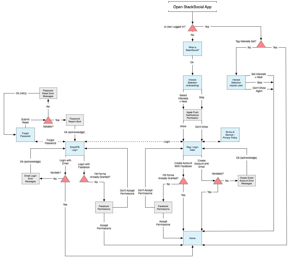
With mobile UX and the app store still in its early days, my goal was to ensure users could seamlessly browse and purchase curated tech products on mobile just as easily as they could on web. This involved creating a design system that would keep the brand identity consistent across all platforms, along with a lot of research, testing, and experimenting with emerging UX patterns for both iOS and Android.
Keeping Branding Consistent
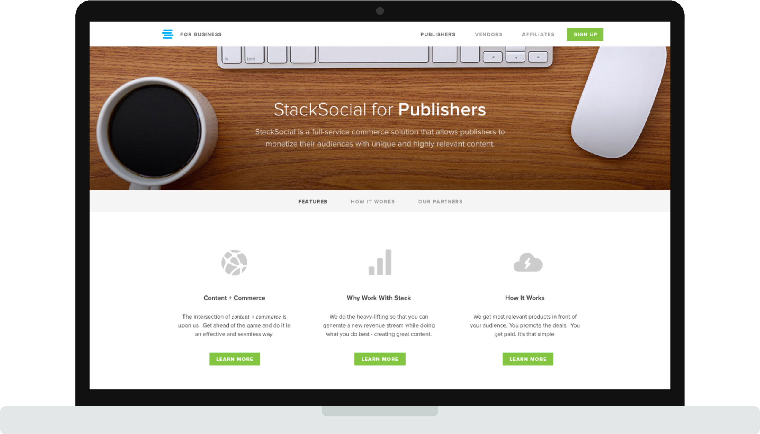
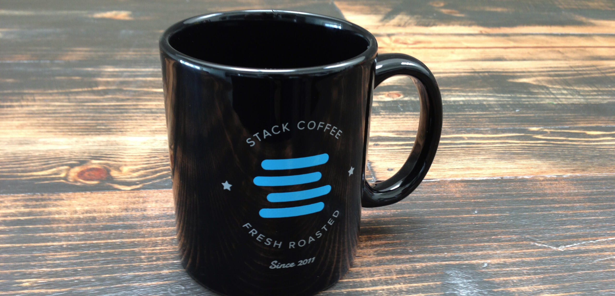
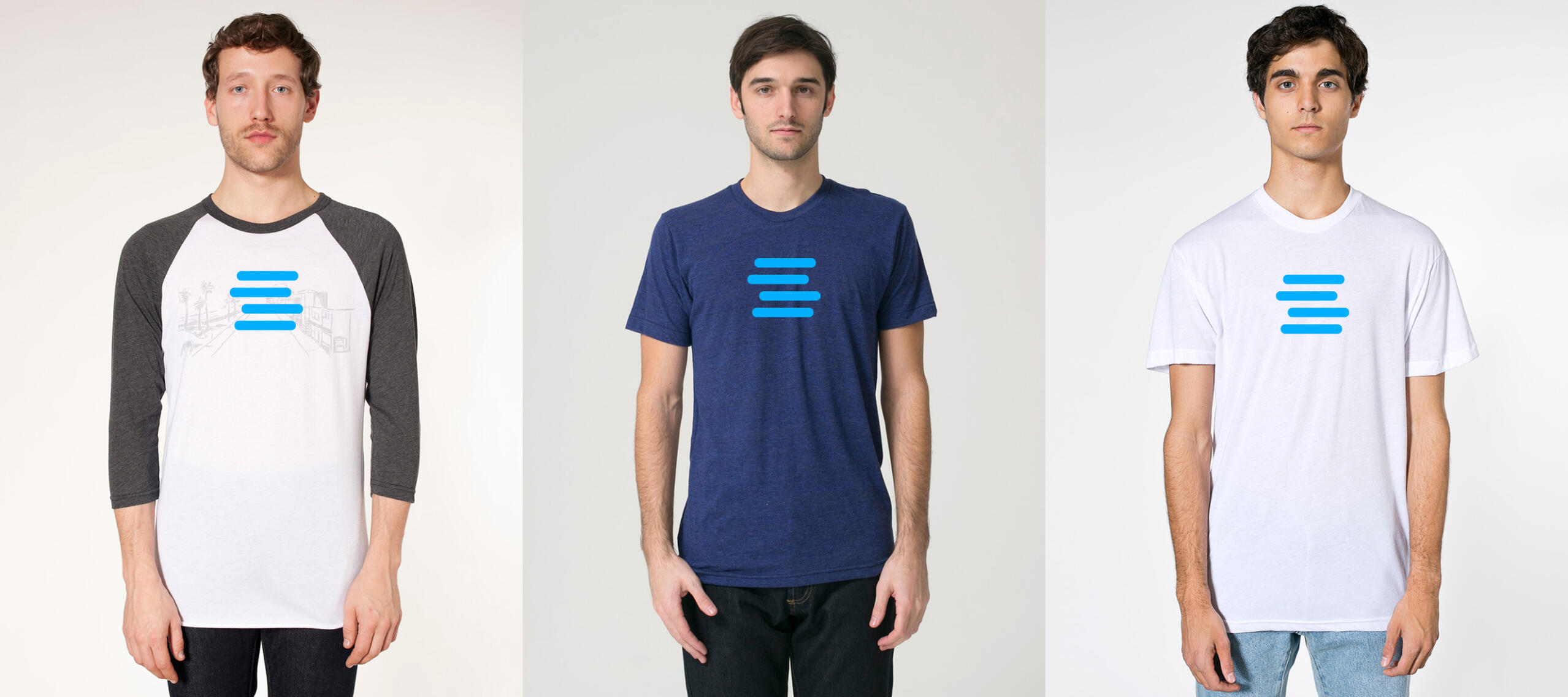
Beyond the app and website, I designed cross-channel assets to enhance user engagement and drive growth. These included email campaigns, social media graphics, and print materials. Each design was carefully crafted to capture the brand’s voice and deliver a consistent look and feel across digital and physical touchpoints.
Scaling for Growth
As StackSocial grew, so did the demands on its design systems. As Lead Designer, I ensured the brand’s identity and digital assets could evolve with the company’s rapid growth. This included creating templates and guidelines that allowed the design team to stay consistent and efficient as the company scaled.
From Startup to Acquisition
The early design efforts at StackSocial were instrumental in laying the groundwork for its evolution into StackCommerce and acquisition by TPG in 2021. This period highlighted the importance of thoughtful design in driving user engagement and supporting business growth.StackSocial’s success wouldn’t have been possible without the visionary leadership of Josh Payne and the incredible team that brought his ideas to life. Josh’s passion, guidance, and commitment to innovation inspired everyone to push boundaries and deliver something extraordinary. Collaborating with such a talented group of individuals was an honor, and their dedication to building a groundbreaking platform made every challenge a rewarding experience.Working at StackSocial was one of the most impactful experiences of my career. It gave me the chance to help shape a company’s identity during its formative years and see the tangible results of our collective efforts. I’m deeply grateful for the opportunity to contribute, grow, and learn alongside such an inspiring team. This journey taught me invaluable lessons about design, teamwork, and scaling ideas into reality—lessons I carry with me in every project I take on.

Beverly Hills Luxury Leases
BH Luxury Leases
Design system, UI/UX, web
+
Overview
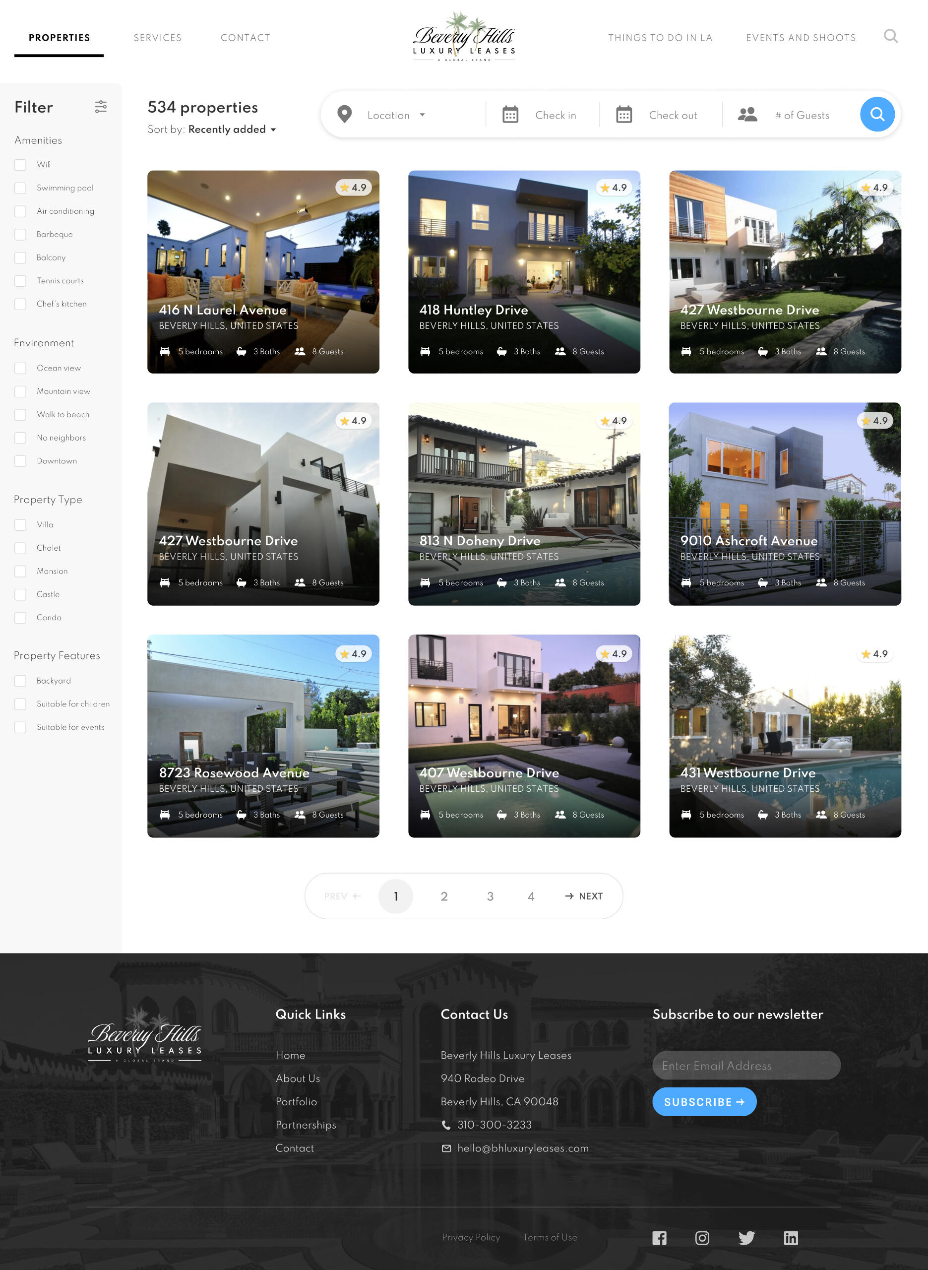
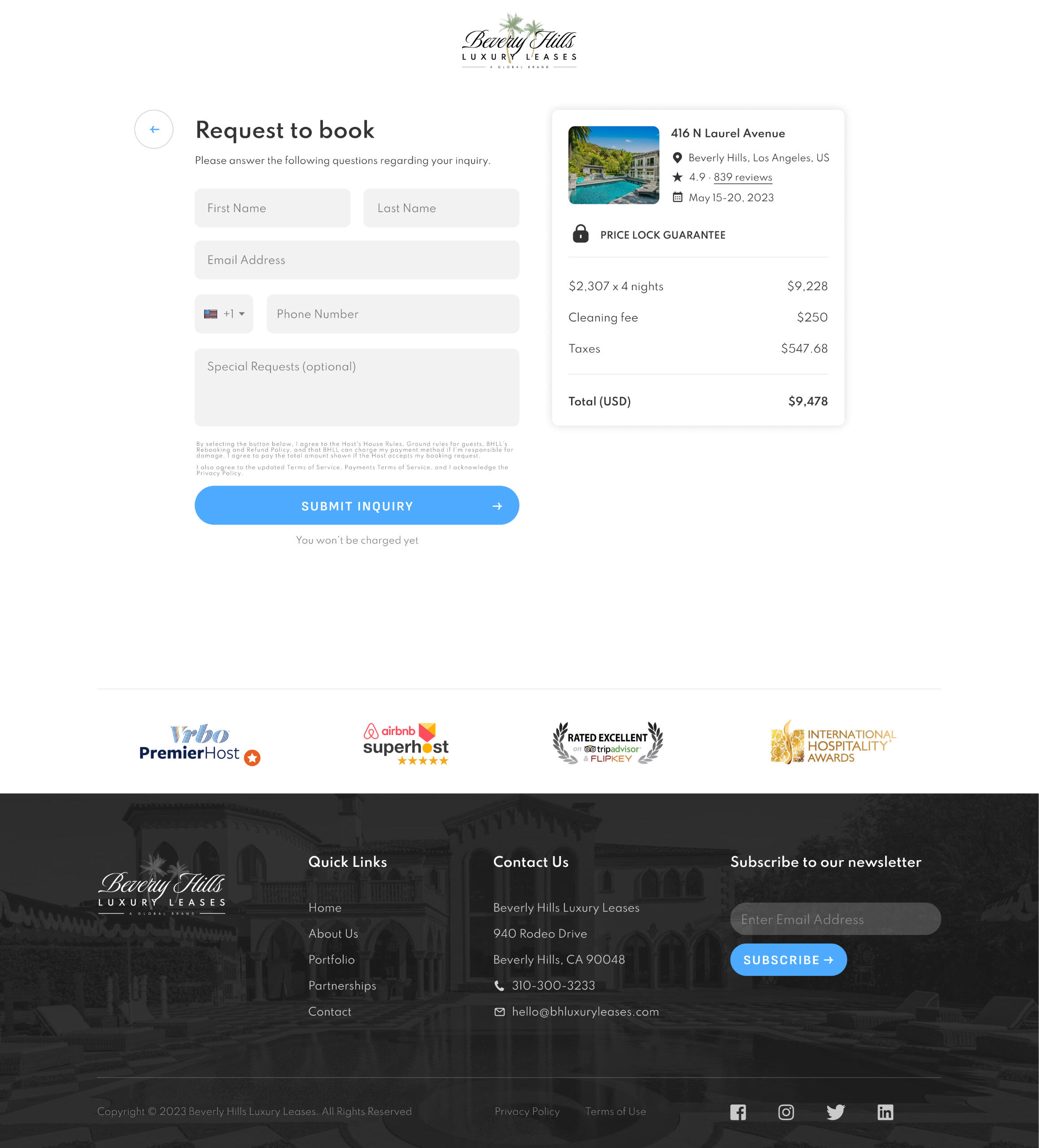
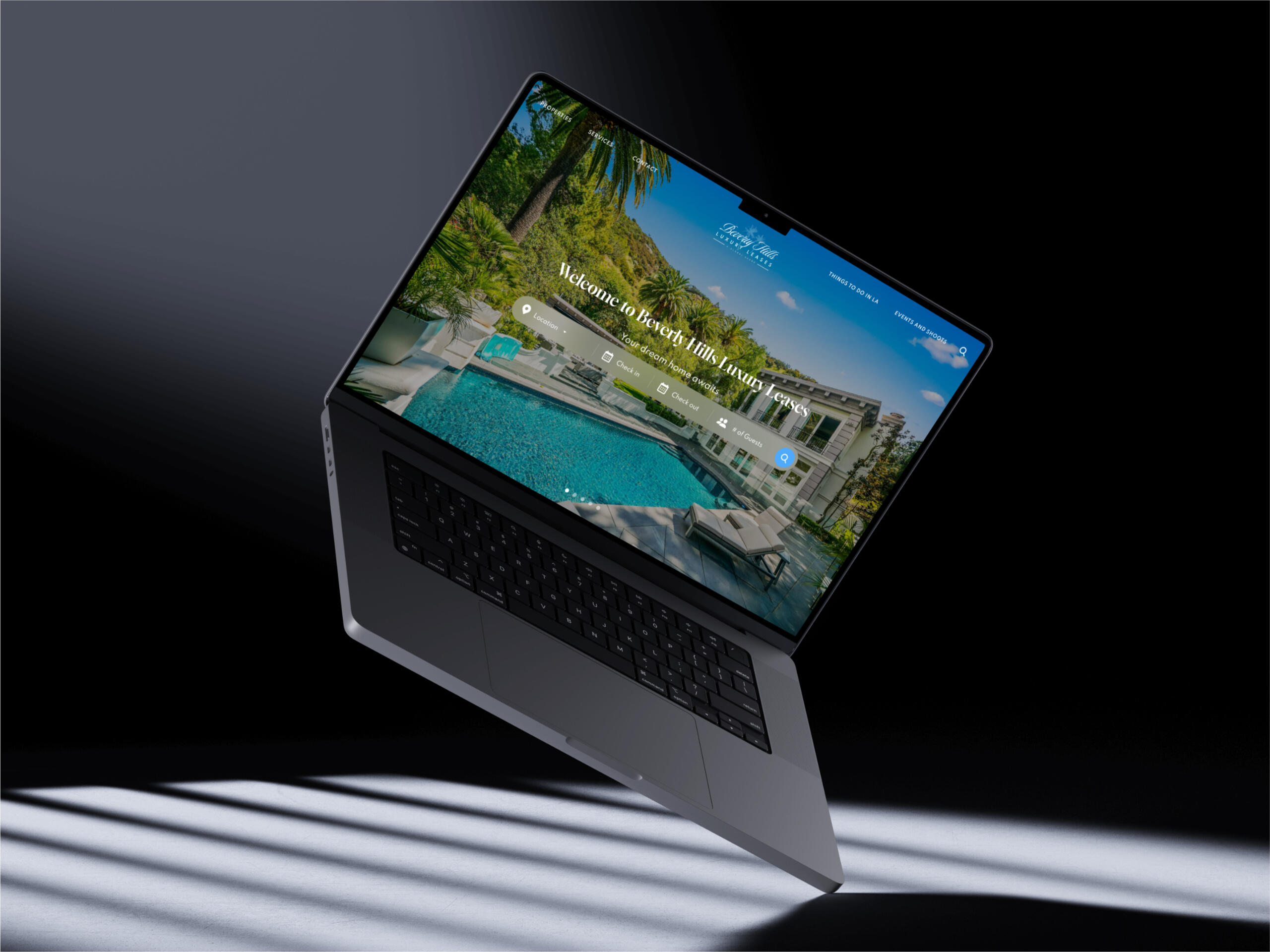
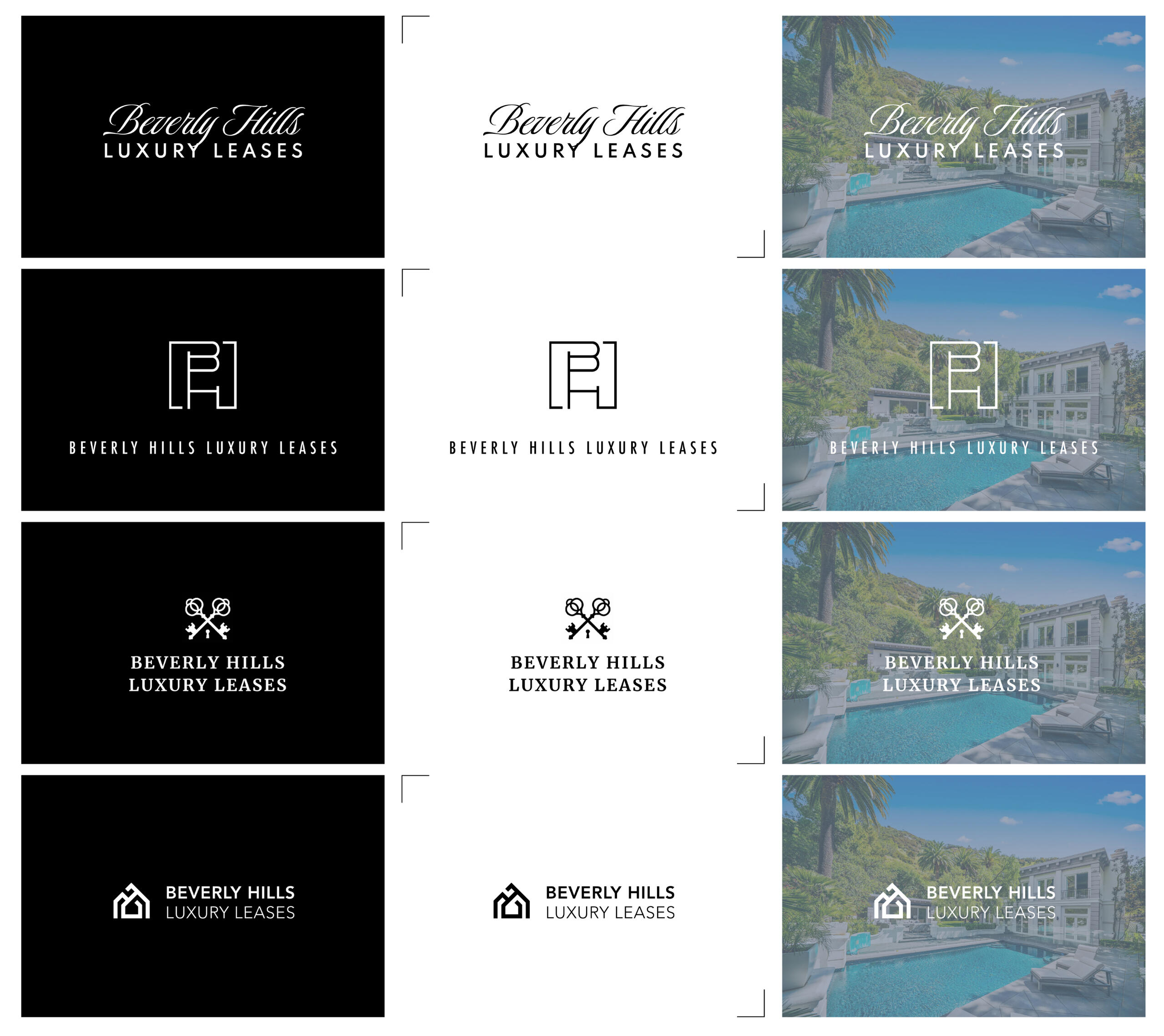
Beverly Hills Luxury Leases, a renowned real estate development firm specializing in high-end luxury homes, wanted to launch a website that allowed wealthy clients to find, book, and reserve luxury vacation rentals. The website needed to reflect the sophistication of the brand while ensuring trust and security, crucial for clients spending upwards of $10,000 per night.
Role
As a UX/UI designer, I worked on designing and building the website for Beverly Hills Luxury Leases (BHLL). This included creating the logo, branding, design systems, and a user-friendly website tailored to affluent customers seeking luxury vacation rentals.
Challenge
My goal was to create a visually stunning and highly functional website that:
Reflected the exclusivity and elegance of the BHLL brand.
Simplified the booking process for users.
Established trust and security to encourage confident transactions.
More coming soon...

YouTube Music
Concept, UI/UX
+
Overview
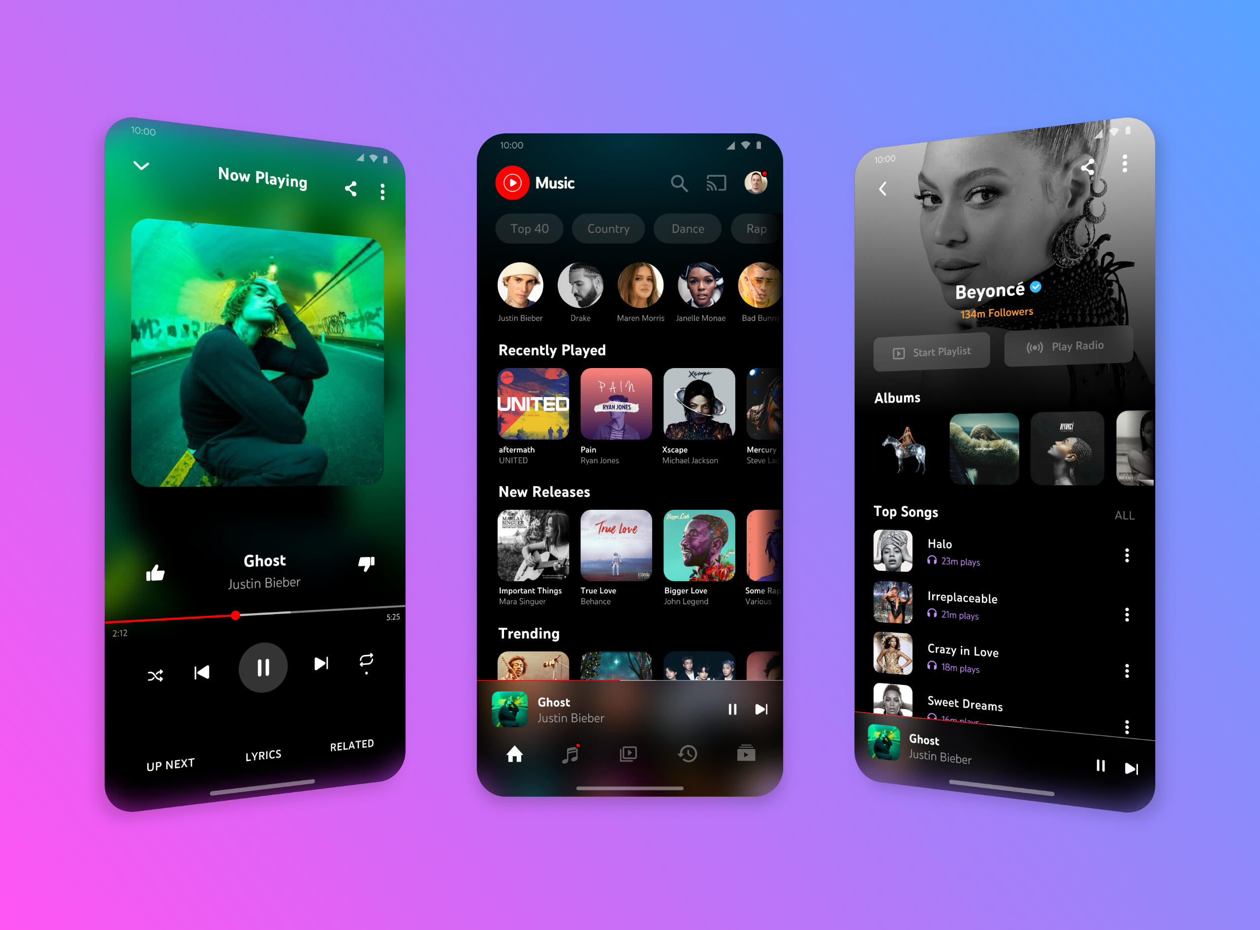
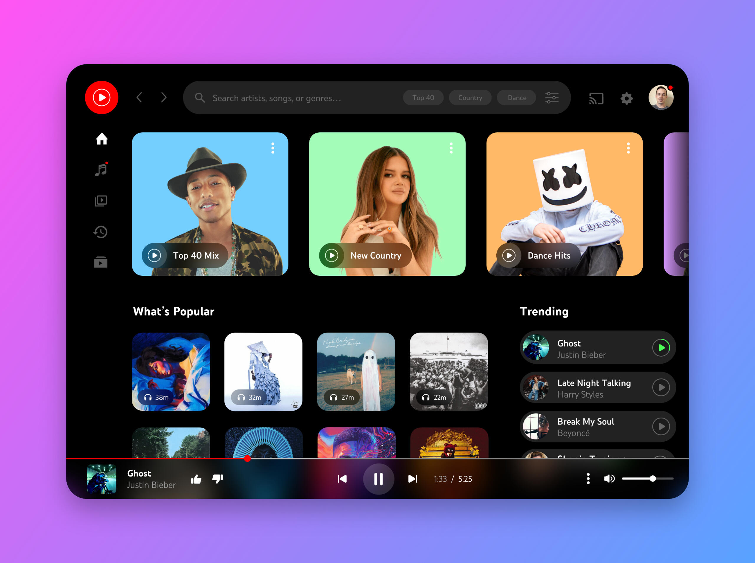
As a personal project, I challenged myself to redesign the YouTube Music mobile and tablet UI while learning Adobe xD for the first time. This project was an opportunity to dive into a new tool, experiment with design workflows, and reimagine a popular platform with a focus on usability and visual appeal.
Goals
Simplify navigation to enhance the user experience for discovering and playing music.
Create a cohesive and responsive design that adapts seamlessly between mobile and tablet devices.
Experiment with Adobe xD’s features, including prototyping, components, and animations.
Key Features
Introduced a cleaner tab system and better organization of playlists and recommendations.
Redesigned and simplified layout of content using bold typography and large images to reduce clutter and cognitive load.
Made use of Adobe xD’s advanced interface design tools and current design trends such as blurred backgrounds and minimalistic icons to improve usability.
Reflection
This project not only strengthened my expertise with Adobe xD and interface design but also reinforced the importance of balancing functionality with aesthetics in designing for cross-platform experiences. It was a fun and rewarding process to rethink a well-known app through a fresh lens.

Upplink
Branding, UI/UX, web
+
Coming soon...

Nightlive
Concept, UI/UX, web
+
Overview
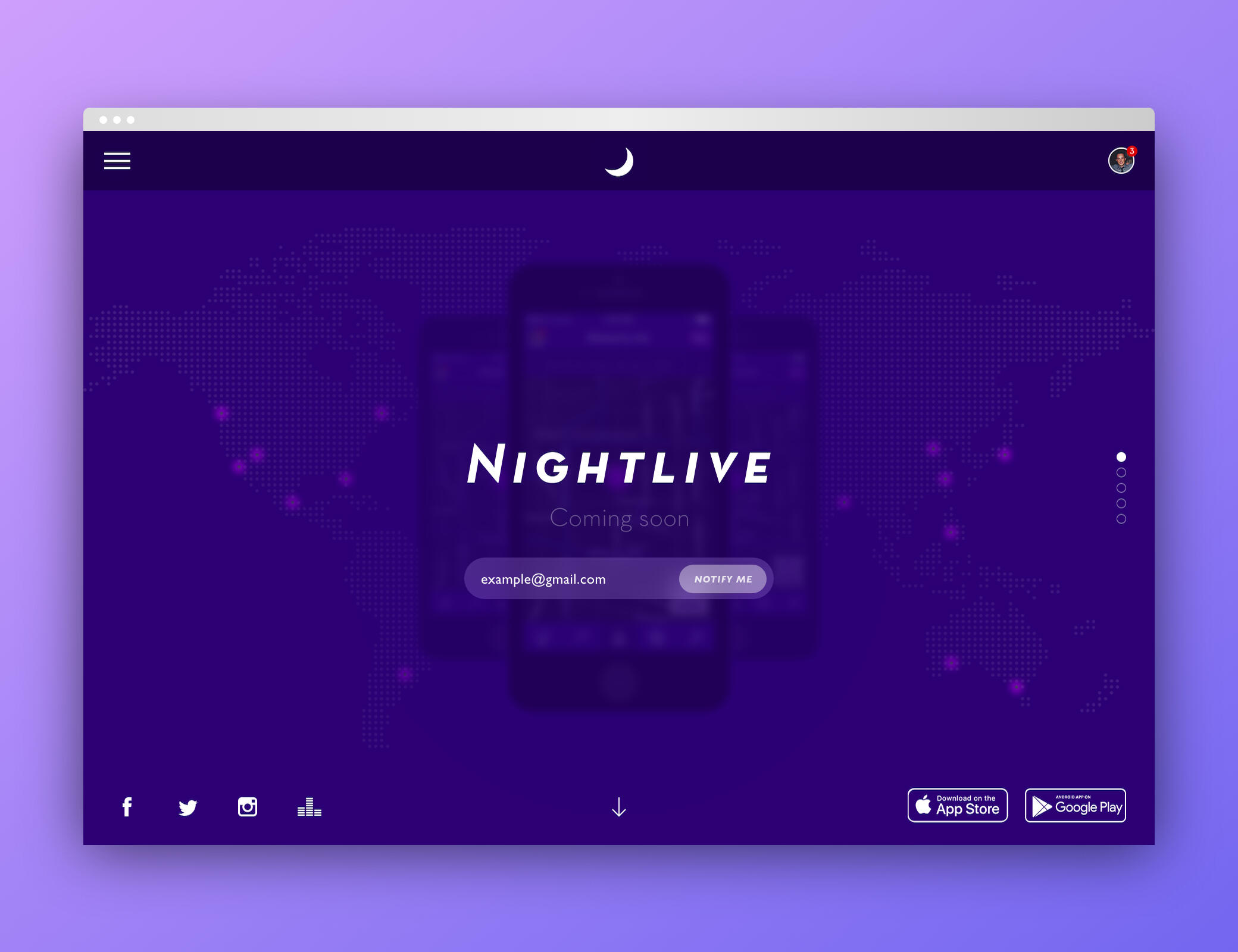
Nightlive was a concept I created in 2014 for a mobile app aimed at helping party-goers connect and discover nightlife hotspots in real time. The goal was to build a social platform that gave users live updates on venues, crowds, and trending events nearby. Though the project didn’t move past the concept stage, it served as a creative exploration into location-based, real-time UX.
Goals
Help users discover the best local nightlife experiences in real time.
Enable users to connect socially through shared check-ins and live event feeds.
Provide venues with a platform to promote current events and drive foot traffic.
Problem
People often rely on outdated reviews or word-of-mouth to decide where to go out, with little real-time insight into what’s actually happening at a venue.
Solution
Nightlive aimed to solve this by offering a live, user-powered feed of local nightlife activity, check-ins, and trending spots—helping users make spontaneous, informed decisions about where to go next.
Conclusion
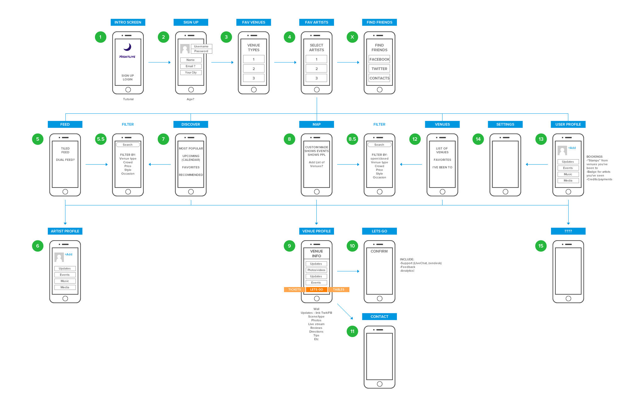
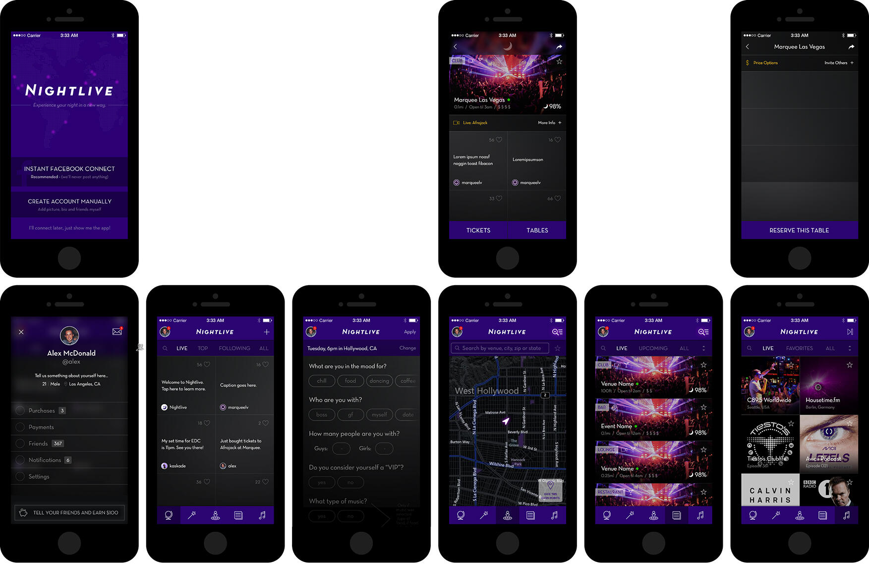
Although Nightlive never made it beyond the concept phase, the process allowed me to explore social-first UX patterns, real-time interactions, and early mobile design trends. Designing the logo, landing page, wireframes, and high-fidelity mockups gave me hands-on experience shaping a product vision from the ground up. The project remains a fun and forward-thinking snapshot of early mobile innovation in the geosocial and nightlife space.
Journal
7 Reasons Why AI Will Never Truly Replace Designers
+
January 23, 2025
The rise of Gen AI has sparked countless debates about its impact on various professions, including design. While AI tools can assist in generating ideas, automating repetitive tasks, and even creating impressive visuals, they lack something fundamental to great design: the human touch. Let’s explore why designers will always be irreplaceable in a world where AI is becoming increasingly advanced.
1. Empathy Can't Be Automated
Great design starts with understanding people—their emotions, needs, and challenges. Designers bring empathy to the table, a uniquely human trait that AI can’t replicate. Crafting solutions that resonate on an emotional level requires more than data; it requires connection.
Example: Consider accessibility. Designers understand the nuanced challenges faced by people with disabilities and can create inclusive solutions tailored to diverse experiences—something AI alone cannot intuitively grasp.
2. Creativity Thrives on the Unexpected
AI is brilliant at working within parameters and replicating patterns. However, true creativity often emerges from breaking those patterns, challenging norms, and exploring the unexpected. Designers are not bound by algorithms; they’re inspired by life, art, and culture—elements AI can’t fully comprehend.
3. Context Is Key
AI excels at processing information but often misses the subtle context that shapes meaningful design decisions. Designers, on the other hand, consider cultural nuances, ethical implications, and brand identity to ensure their work fits the bigger picture.
Example: A logo generator might create a visually appealing design, but only a designer can ensure it aligns with a company’s mission, values, and audience.
4. Collaboration Drives Innovation
Design is rarely a solo endeavor. It thrives in collaborative environments where teams brainstorm, debate, and refine ideas together. AI lacks the ability to participate in these dynamic, iterative processes or to respond to the unspoken cues that drive creative collaboration.
5. Storytelling Sets Designers Apart
Designers don’t just create; they communicate. They tell stories through their work, weaving narratives that resonate with users on a deeper level. AI can generate content, but it lacks the emotional intelligence to craft stories that inspire, motivate, and connect.
6. Ethical Decision-Making Is Human
Design has a profound impact on society, and ethical considerations are at the core of the design process. Designers weigh the potential consequences of their work, ensuring it serves the greater good. AI, on its own, can’t make moral judgments or foresee long-term societal implications.
7. AI Is a Tool, Not a Creator
At its best, AI is a powerful tool that amplifies human creativity—it’s not a replacement for it. Tools like Figma’s AI-powered features or generative art programs can streamline workflows and enhance productivity, but the vision and strategy behind the work still come from human designers.
AI is without a doubt transforming the creative industry, but it’s not here to replace designers—it’s here to empower them. By automating repetitive tasks and generating ideas, AI frees designers to focus on what they do best: crafting meaningful, empathetic, and innovative solutions.As we embrace AI, let’s remember that the heart of design will always be human.What’s your take? Will AI ever fully replace designers? Let’s discuss in the comments.#AIDesign #UXDesign #Creativity #HumanCenteredDesign #ArtificialIntelligence #EmpathyInDesign
Making Amazon’s Baby Registry More Accessible for the Elderly
+
December 18, 2024
I recently observed my elderly mother attempt to navigate Amazon’s baby registry to purchase gifts for a family member. As she struggled to complete the simple task, I noticed several usability challenges and areas for improvement. As a UX designer focused on people-centered solutions, I was inspired to rethink the platform's UI/UX to make the process more accessible, intuitive, and enjoyable, especially for users who may not be so tech-savvy.
Current Version (Landing Page)
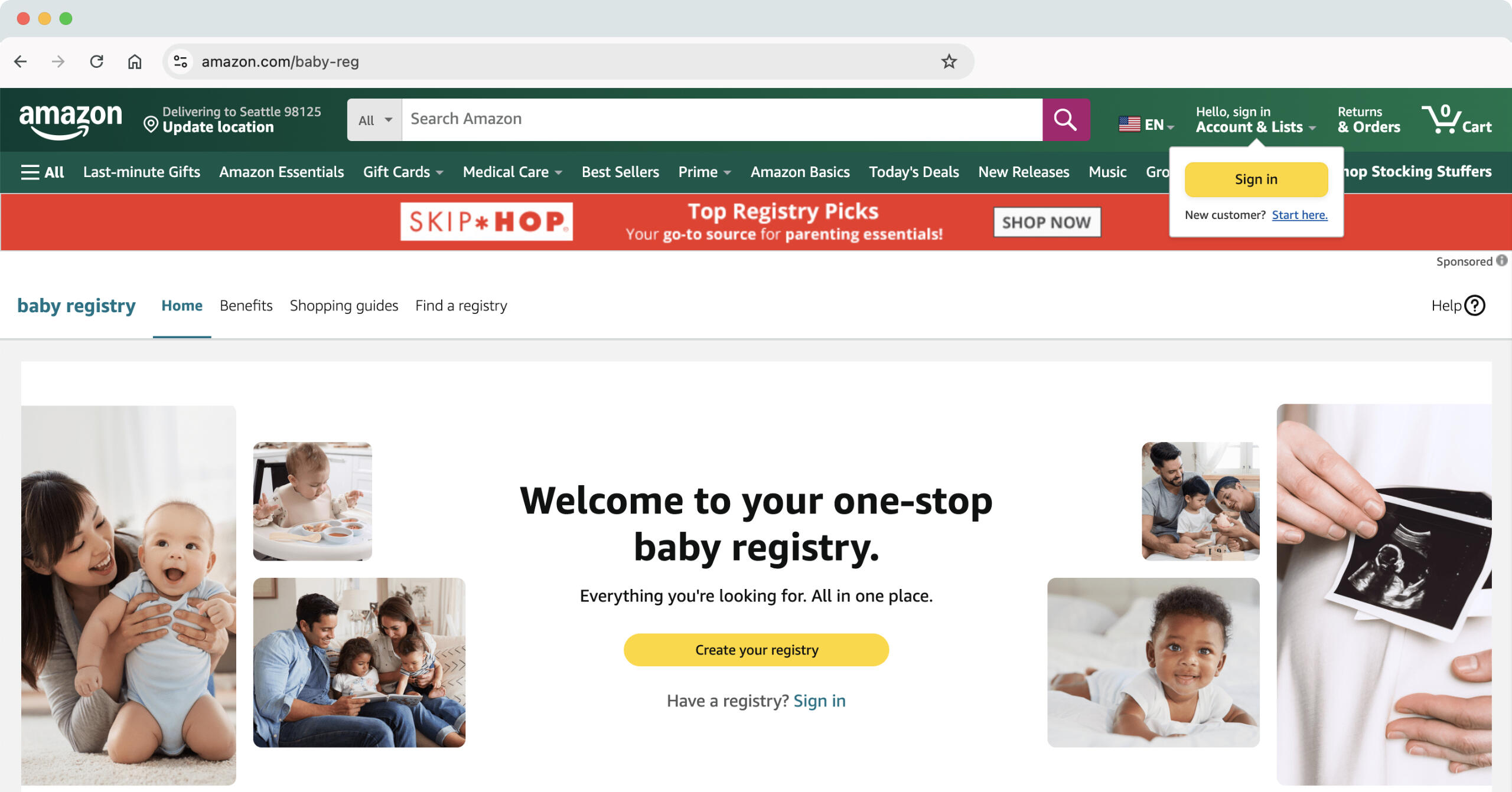
Upon getting the Baby Registry card in the mail from our loved ones who are expecting, we searched for "Amazon baby registry" and landed on the registry page above.Potential Issues
The page is nice if you are creating a registry, but searching for one is not very intuitive, especially for someone who has never done it before.
The search box for looking up a registry is just below the fold (depending on screen size) and not apparent on first glance.
The 'Find a registry' link is not easily found in the sub-menu and my mom looked right over it.
Current Version (Search)
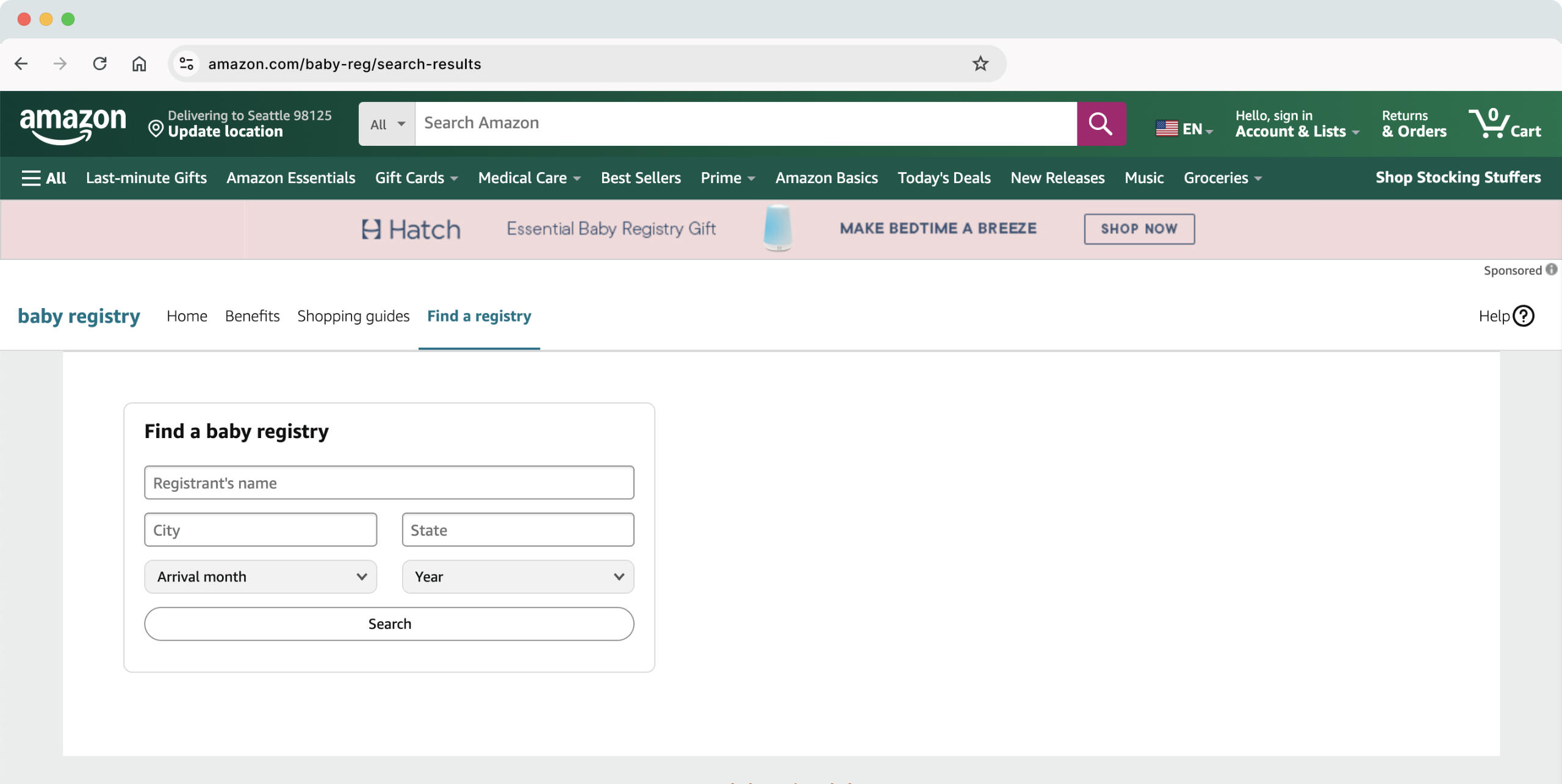
After going back to the search results, we clicked on the 2nd link: "Baby Registry Search" and were brought to this page where we could directly search for the registry.Potential Issues
The multi-column table layout makes it difficult for users, especially those less familiar with technology, to find what they need quickly. It also lacks visual differentiation, making it harder to distinguish important elements.
The Search button (CTA) is plain white and looks/feels the same as the input fields, leading to confusion.
The excessive/optional input fields can create cognitive overload, which is exactly what happened to my Mom.
Current Version (Search Results)
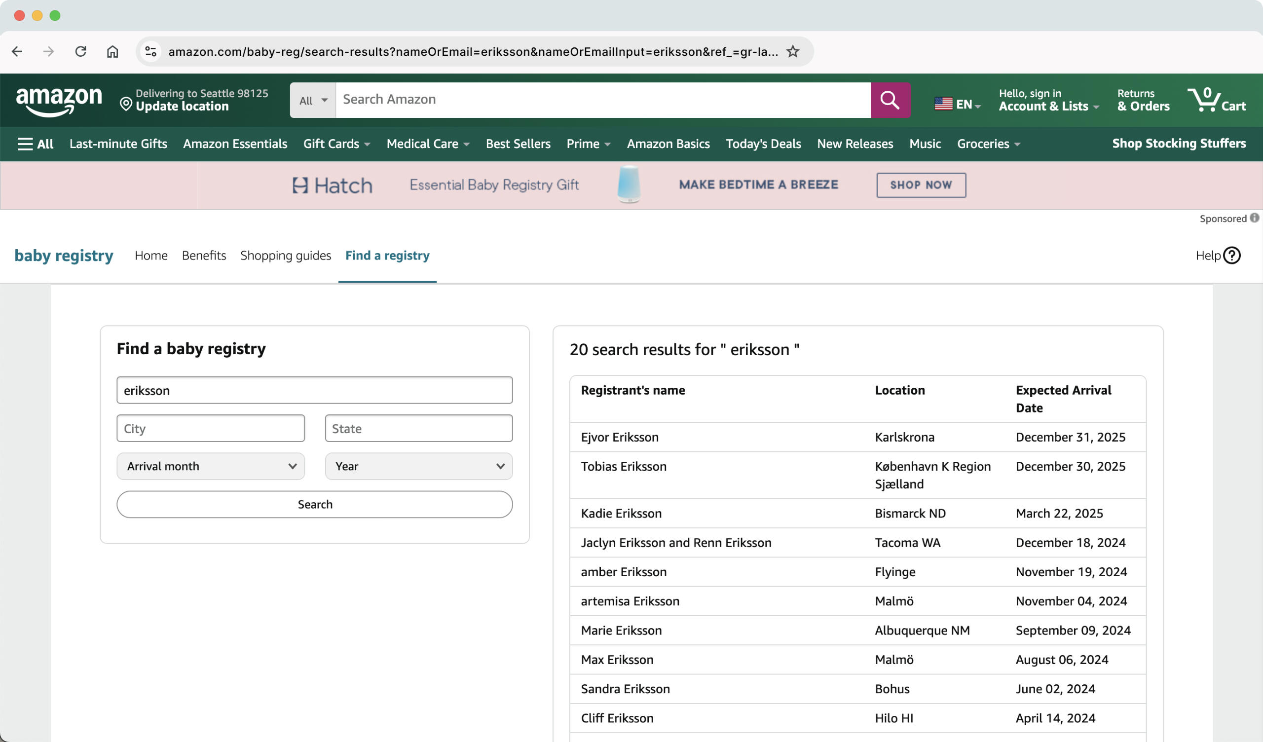
After having to guide my Mom to complete the search, a basic table to the right displays 20 results for the last name, some of which were completely irrelevant, having been created more than a year ago.Potential Issues
Lack of "Call to Action" makes it difficult to know where to click next.
The outdated or irrelevant registries without clear sorting or filtering options makes it difficult to find the correct registry quickly.
Designing for Accessibility and Simplicity
My approach to redesigning the Amazon Baby Registry experience focused on removing barriers and creating a user-friendly journey for all, specifically for non-tech-savvy users like my mom. By rethinking UX elements such as intuitive navigation, clear visual hierarchy, and thoughtful interactions, I hoped to simplify the process of finding and purchasing registry items. This redesign shows how subtle UX design improvements can empower users of all ages and abilities to navigate digital platforms with confidence.
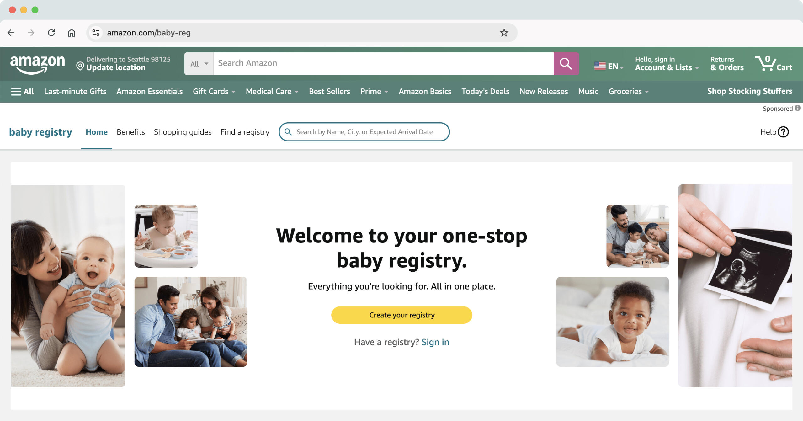
Redesigned Version (Landing Page)
My Approach
Lightened the header to make the content stand out more effectively.
Added a search bar next to "Find a Registry" so users will easily be able to search directly from this page.
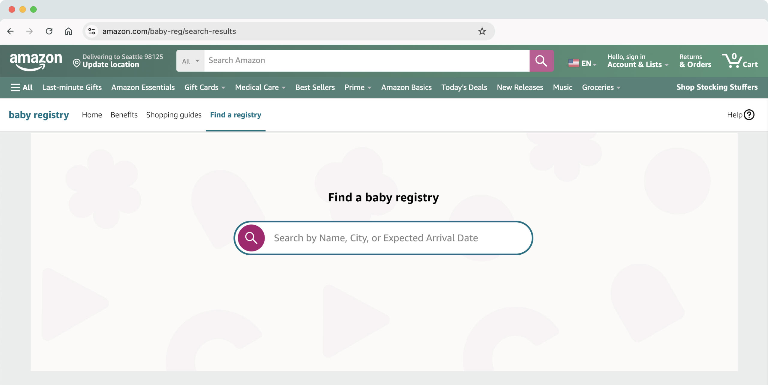
Redesigned Version (Search)
My Approach
Created a much cleaner and simpler search page with a large, prominent search bar and a clear "Call to Action".
Removed unnecessary fields, allowing users to focus on key search criteria like name, location, or expected arrival date for more relevant results.
Added a playful background to make the experience more welcoming and enjoyable.
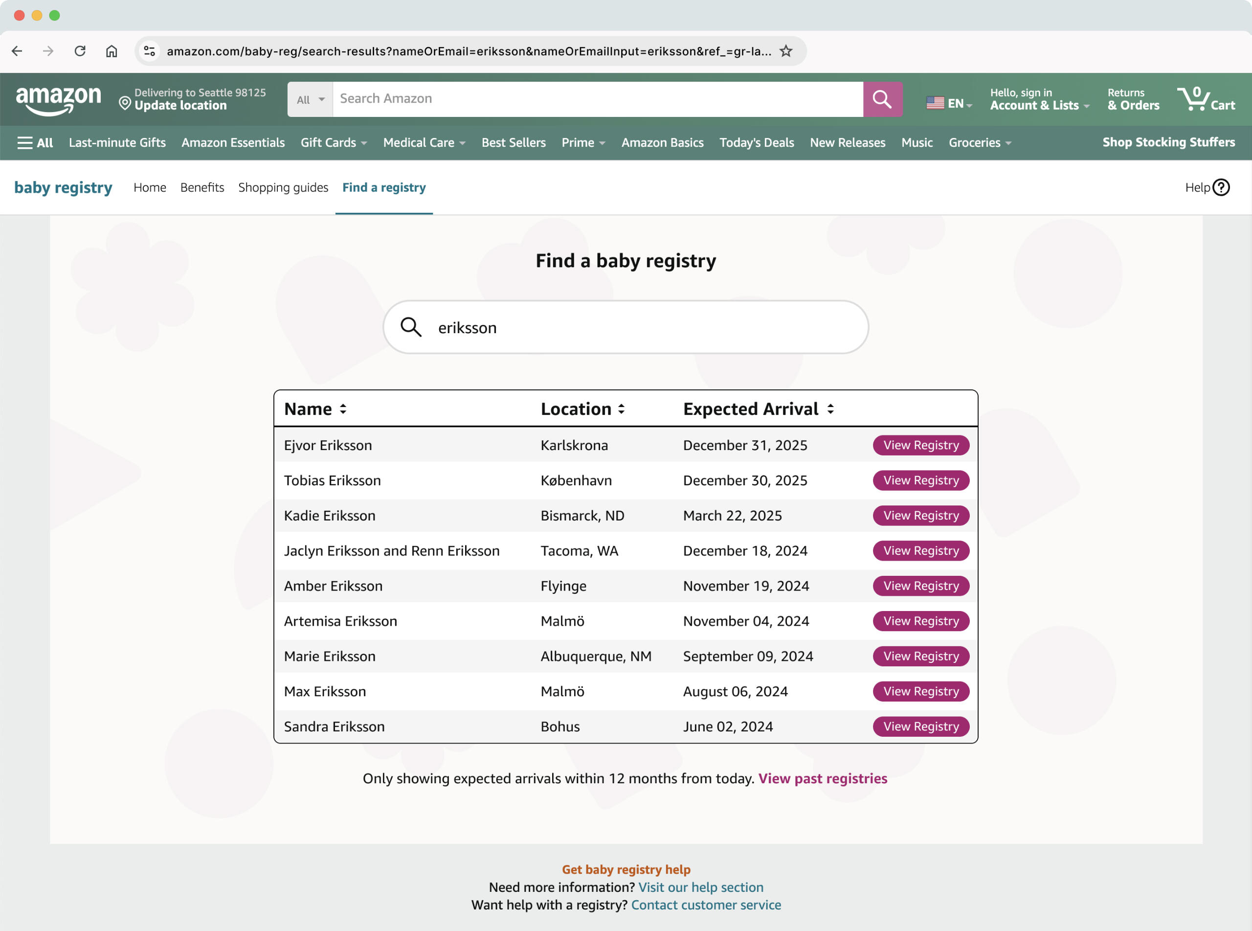
Redesigned Version (Search Results)
My Approach
List would auto-populate as the user starts typing into the search bar.
Added the ability to sort by Name, Location or Arrival Date.
Clear "Call to Action" on each registry listing, leading to the individual registry page.
The outdated registries have been removed from the search results page, but are still accessible via a link below the results.
Added "zebra striping", a light grey alternating background between table rows, to help with readability.
Outcome
The redesigned baby registry experience prioritizes accessibility and usability, making it easier for users like my mom to navigate and accomplish tasks with confidence. By focusing on clear guidance, intuitive design, and thoughtful interactions, the solution bridges the gap between modern e-commerce systems and the needs of less tech-savvy users.I gave my mother a prototype of the new design, and she immediately felt more comfortable in navigating the platform and accomplishing her task. (The fact that she had gone through the process once before might have helped a bit.)This project was a personal reminder of how impactful design can be when it truly considers the diverse range of people using a product. The mockup simplifies the process of finding and purchasing registry items. It also demonstrates how inclusive design can create a more empowering and enjoyable user experience for everyone.
3 Reasons Why Startups Should Lead With UX
+

December 9, 2024
In the rush to build the next big thing, it’s tempting to dive straight into development. But here’s the catch: without a strong UX foundation, you’re building on shaky ground.Here’s why startups should prioritize UX first:
User-centered design saves time – By understanding user needs upfront, you avoid costly rework later.
UX defines the vision – Great UX isn’t just about looks; it sets the functional blueprint for dev teams.
Fewer features, more impact– UX helps identify the right features to build, not just the flashy ones.
"Great products aren’t coded first—rather, they’re first designed with users in mind."
When UX leads and development follows, you’re creating solutions with purpose and clarity—not just features.How has leading with UX impacted your projects? Share your experiences in the comments!#UXDesign #Startups #ProductDevelopment #UserExperience #LeanDesign #ATMDesign
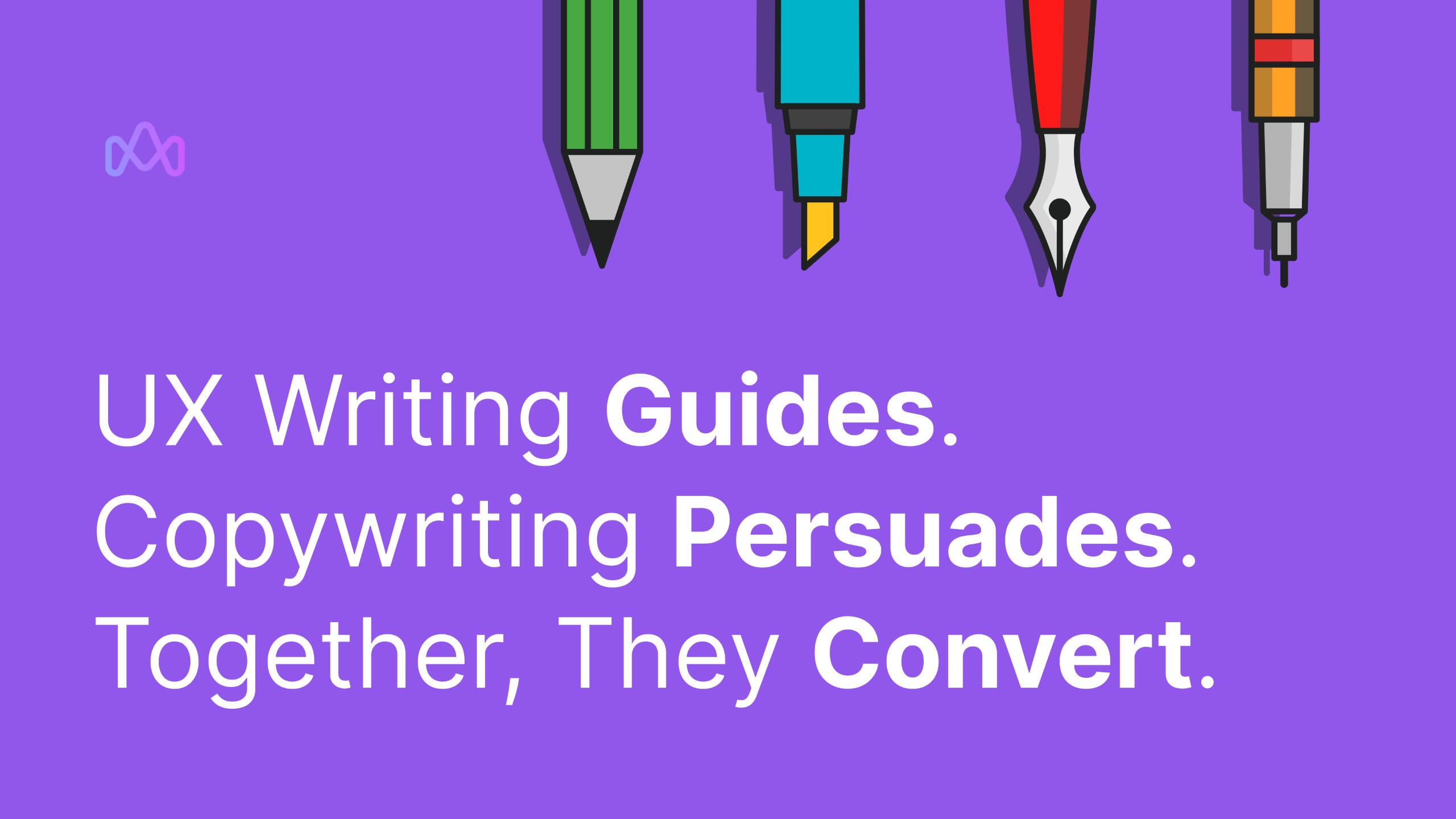
How Simple Copywriting Can Completely Change UX
+
December 2, 2024
Have you ever seen a form that said, ☑️ “Subscribe to mailing list” and just ignored it?Now imagine instead: ☑️ “Rare updates and free stuff”Same function, completely different vibe. That’s the power of microcopy!Here’s why great UX depends on great copy:
It sets expectations – Users know exactly what they’re signing up for.
It connects emotionally – Phrases like "rare" and "free" feel personal and valuable.
It encourages action – The right words inspire clicks and conversions.
"Words are the bridge between design and user interaction."
When your UX design and copywriting work together, you create experiences that speak to your audience—literally and figuratively.What’s your favorite example of clever copy improving UX? Let us know in the comments.#UXDesign #Copywriting #Microcopy #UserExperience #DigitalDesign #ATMDesign
Contact
Have a project, idea or initiative in mind? Let's make it happen.
Have a project or idea in mind? Let's make it happen.
+
© 2025 Alex McDonald
© 2025 Alex McDonald
© 2025 Alex McDonald
© 2025 Alex McDonald

